Now that you can create your own line charts, it's time to learn about more chart types!
现在您可以创建自己的折线图,是时候了解更多图表类型了!
By the way, if this is your first experience with writing code in Python, you should be very proud of all that you have accomplished so far, because it's never easy to learn a completely new skill! If you stick with the course, you'll notice that everything will only get easier (while the charts you'll build will get more impressive!), since the code is pretty similar for all of the charts. Like any skill, coding becomes natural over time, and with repetition.
顺便说一句,如果这是您第一次使用 Python 编写代码,您应该为迄今为止所取得的成就感到“非常自豪”,因为学习一项全新的技能绝非易事! 如果您坚持学习本课程,您会发现一切只会变得更容易(而您将构建的图表将变得更加令人印象深刻!),因为所有图表的代码都非常相似。 与任何技能一样,随着时间的推移和重复,编码会变得自然。
In this tutorial, you'll learn about bar charts and heatmaps.
在本教程中,您将了解条形图和热力图。
Set up the notebook
设置笔记本
As always, we begin by setting up the coding environment. (This code is hidden, but you can un-hide it by clicking on the "Code" button immediately below this text, on the right.)
与往常一样,我们首先设置编码环境。 (此代码是隐藏的,但您可以通过单击右侧紧邻此文本下方的“代码”按钮来取消隐藏它。)
import pandas as pd
pd.plotting.register_matplotlib_converters()
import matplotlib.pyplot as plt
%matplotlib inline
import seaborn as sns
print("Setup Complete")
Setup CompleteSelect a dataset
选择一个数据集
In this tutorial, we'll work with a dataset from the US Department of Transportation that tracks flight delays.
在本教程中,我们将使用美国交通部跟踪航班延误的数据集。
Opening this CSV file in Excel shows a row for each month (where 1 = January, 2 = February, etc) and a column for each airline code.
在 Excel 中打开此 CSV 文件会显示每个月的一行(其中1= 一月,2= 二月等)以及每个航空公司代码的一列。
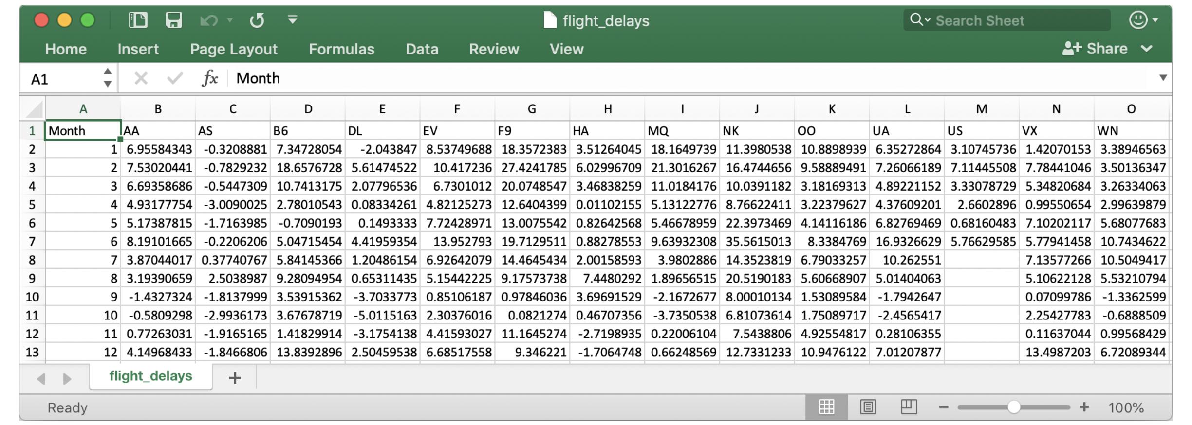
Each entry shows the average arrival delay (in minutes) for a different airline and month (all in year 2015). Negative entries denote flights that (on average) tended to arrive early. For instance, the average American Airlines flight (airline code: AA) in January arrived roughly 7 minutes late, and the average Alaska Airlines flight (airline code: AS) in April arrived roughly 3 minutes early.
每个条目显示不同航空公司和月份(均在 2015 年)的平均到达延误时间(以分钟为单位)。 负数条目表示(平均)航班往往提前到达。 例如,美国航空 (航空公司代码:AA) 1 月份的航班平均晚点约 7 分钟,阿拉斯加航空 (航空公司代码:AS) 4 月份的航班平均提前约 3 分钟 。
Load the data
加载数据
As before, we load the dataset using the pd.read_csv command.
和以前一样,我们使用pd.read_csv命令加载数据集。
# Path of the file to read
flight_filepath = "../00 datasets/alexisbcook/data-for-datavis/flight_delays.csv"

# Read the file into a variable flight_data
flight_data = pd.read_csv(flight_filepath, index_col="Month")
You may notice that the code is slightly shorter than what we used in the previous tutorial. In this case, since the row labels (from the 'Month' column) don't correspond to dates, we don't add parse_dates=True in the parentheses. But, we keep the first two pieces of text as before, to provide both:
您可能会注意到该代码比我们在上一个教程中使用的代码稍短。 在这种情况下,由于行标签(来自月列)与日期不对应,因此我们不在括号中添加parse_dates=True。 但是,我们像以前一样保留前两段文本,以提供两者:
- the filepath for the dataset (in this case,
flight_filepath), and - 数据集的文件路径(在本例中为
flight_filepath),以及 - the name of the column that will be used to index the rows (in this case,
index_col="Month"). - 将用于索引行的列的名称(在本例中为
index_col="Month")。
Examine the data
检查数据
Since the dataset is small, we can easily print all of its contents. This is done by writing a single line of code with just the name of the dataset.
由于数据集很小,我们可以轻松打印其所有内容。 这是通过仅使用数据集名称编写一行代码来完成的。
# Print the data
flight_data| AA | AS | B6 | DL | EV | F9 | HA | MQ | NK | OO | UA | US | VX | WN | |
|---|---|---|---|---|---|---|---|---|---|---|---|---|---|---|
| Month | ||||||||||||||
| 1 | 6.955843 | -0.320888 | 7.347281 | -2.043847 | 8.537497 | 18.357238 | 3.512640 | 18.164974 | 11.398054 | 10.889894 | 6.352729 | 3.107457 | 1.420702 | 3.389466 |
| 2 | 7.530204 | -0.782923 | 18.657673 | 5.614745 | 10.417236 | 27.424179 | 6.029967 | 21.301627 | 16.474466 | 9.588895 | 7.260662 | 7.114455 | 7.784410 | 3.501363 |
| 3 | 6.693587 | -0.544731 | 10.741317 | 2.077965 | 6.730101 | 20.074855 | 3.468383 | 11.018418 | 10.039118 | 3.181693 | 4.892212 | 3.330787 | 5.348207 | 3.263341 |
| 4 | 4.931778 | -3.009003 | 2.780105 | 0.083343 | 4.821253 | 12.640440 | 0.011022 | 5.131228 | 8.766224 | 3.223796 | 4.376092 | 2.660290 | 0.995507 | 2.996399 |
| 5 | 5.173878 | -1.716398 | -0.709019 | 0.149333 | 7.724290 | 13.007554 | 0.826426 | 5.466790 | 22.397347 | 4.141162 | 6.827695 | 0.681605 | 7.102021 | 5.680777 |
| 6 | 8.191017 | -0.220621 | 5.047155 | 4.419594 | 13.952793 | 19.712951 | 0.882786 | 9.639323 | 35.561501 | 8.338477 | 16.932663 | 5.766296 | 5.779415 | 10.743462 |
| 7 | 3.870440 | 0.377408 | 5.841454 | 1.204862 | 6.926421 | 14.464543 | 2.001586 | 3.980289 | 14.352382 | 6.790333 | 10.262551 | NaN | 7.135773 | 10.504942 |
| 8 | 3.193907 | 2.503899 | 9.280950 | 0.653114 | 5.154422 | 9.175737 | 7.448029 | 1.896565 | 20.519018 | 5.606689 | 5.014041 | NaN | 5.106221 | 5.532108 |
| 9 | -1.432732 | -1.813800 | 3.539154 | -3.703377 | 0.851062 | 0.978460 | 3.696915 | -2.167268 | 8.000101 | 1.530896 | -1.794265 | NaN | 0.070998 | -1.336260 |
| 10 | -0.580930 | -2.993617 | 3.676787 | -5.011516 | 2.303760 | 0.082127 | 0.467074 | -3.735054 | 6.810736 | 1.750897 | -2.456542 | NaN | 2.254278 | -0.688851 |
| 11 | 0.772630 | -1.916516 | 1.418299 | -3.175414 | 4.415930 | 11.164527 | -2.719894 | 0.220061 | 7.543881 | 4.925548 | 0.281064 | NaN | 0.116370 | 0.995684 |
| 12 | 4.149684 | -1.846681 | 13.839290 | 2.504595 | 6.685176 | 9.346221 | -1.706475 | 0.662486 | 12.733123 | 10.947612 | 7.012079 | NaN | 13.498720 | 6.720893 |
Bar chart
柱状图
Say we'd like to create a bar chart showing the average arrival delay for Spirit Airlines (airline code: NK) flights, by month.
假设我们要创建一个柱状图,按月显示 Spirit Airlines( 航空公司代码:NK )航班的平均抵达延误时间。
# Set the width and height of the figure
plt.figure(figsize=(10,6))

# Add title
plt.title("Average Arrival Delay for Spirit Airlines Flights, by Month")

# Bar chart showing average arrival delay for Spirit Airlines flights by month
# 显示Spirit Airlines航班按月平均抵达延误时间的柱状图
sns.barplot(x=flight_data.index, y=flight_data['NK'])

# Add label for vertical axis
plt.ylabel("Arrival delay (in minutes)")
Text(0, 0.5, 'Arrival delay (in minutes)')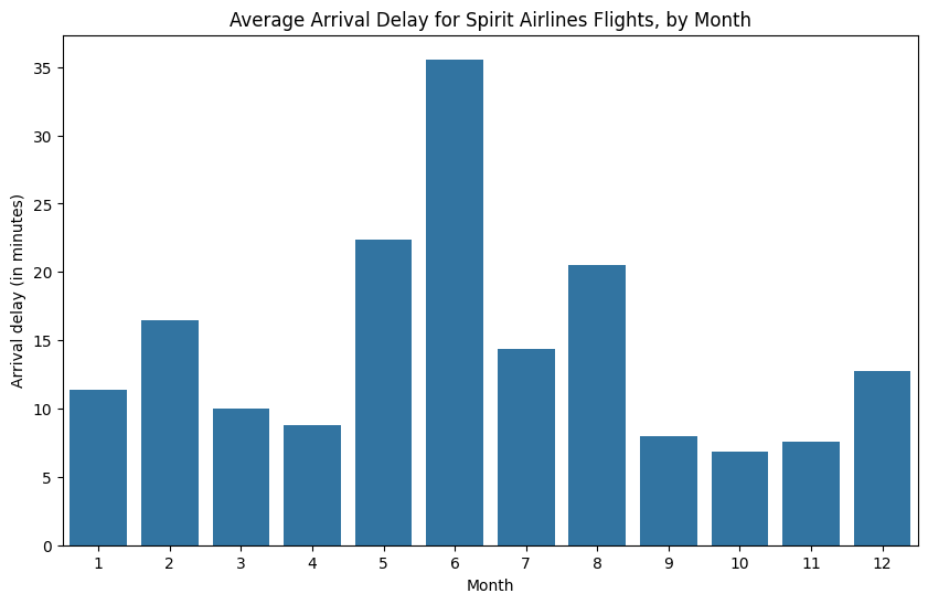
The commands for customizing the text (title and vertical axis label) and size of the figure are familiar from the previous tutorial. The code that creates the bar chart is new:
用于自定义文本(标题和垂直轴标签)和图形大小的命令在上一个教程中很熟悉。 创建柱状图的代码是新的:
# Bar chart showing average arrival delay for Spirit Airlines flights by month
# 显示Spirit Airlines航班按月平均抵达延误时间的柱状图
sns.barplot(x=flight_data.index, y=flight_data['NK'])
It has three main components:
它具有三个主要组成部分:
sns.barplot- This tells the notebook that we want to create a bar chart.- _Remember that
MARKDOWN_HASH6002c6713f40e8a35d365605542e72b0MARKDOWNHASHrefers to the seaborn package, and all of the commands that you use to create charts in this course will start with this prefix.
- _Remember that
sns.barplot- 这告诉笔记本我们要创建一个条形图。- _请记住,
MARKDOWN_HASH6002c6713f40e8a35d365605542e72b0MARKDOWNHASH指的是 seaborn 包,本课程中用于创建图表的所有命令都将以该前缀开头。
- _请记住,
x=flight_data.index- This determines what to use on the horizontal axis. In this case, we have selected the column that indexes the rows (in this case, the column containing the months).x=flight_data.index- 这决定了在水平轴上使用什么数据。 在本例中,我们选择了 index 行的列(在本例中,包含月份的列)。y=flight_data['NK']- This sets the column in the data that will be used to determine the height of each bar. In this case, we select the'NK'column.y=flight_data['NK']- 设置数据中用于确定每个条形高度的列。 在本例中,我们选择NK列。
Important Note: You must select the indexing column with
flight_data.index, and it is not possible to useflight_data['Month'](which will return an error). This is because when we loaded the dataset, the"Month"column was used to index the rows. We always have to use this special notation to select the indexing column.重要提示:您必须使用
flight_data.index选择索引列,并且不能使用flight_data['Month'](这将返回错误)。 这是因为当我们加载数据集时,月列用于索引行。 我们总是必须使用这种特殊符号来选择索引列。
Heatmap
热力图
We have one more plot type to learn about: heatmaps!
我们还有另一种绘图类型需要了解:热力图!
In the code cell below, we create a heatmap to quickly visualize patterns in flight_data. Each cell is color-coded according to its corresponding value.
在下面的代码单元中,我们创建一个热力图来快速可视化flight_data中的数据。 每个单元格根据其相应的值进行颜色编码。
# Set the width and height of the figure
plt.figure(figsize=(14,7))

# Add title
plt.title("Average Arrival Delay for Each Airline, by Month")

# Heatmap showing average arrival delay for each airline by month
# 热力图按月显示每家航空公司的平均到达延误时间
sns.heatmap(data=flight_data, annot=True)

# Add label for horizontal axis
plt.xlabel("Airline")
Text(0.5, 47.7222222222222, 'Airline')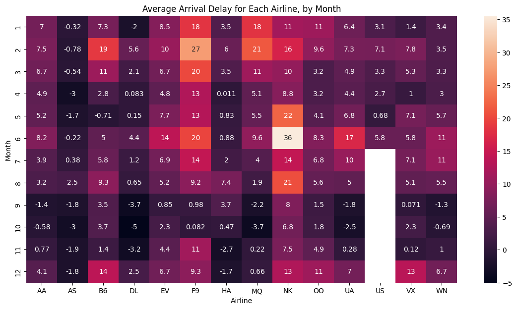
The relevant code to create the heatmap is as follows:
创建热力图的相关代码如下:
# Heatmap showing average arrival delay for each airline by month
sns.heatmap(data=flight_data, annot=True)
This code has three main components:
该代码包含三个主要组成部分:
sns.heatmap- This tells the notebook that we want to create a heatmap.sns.heatmap- 这告诉笔记本我们要创建一个热力图。data=flight_data- This tells the notebook to use all of the entries inflight_datato create the heatmap.data=flight_data- 这告诉笔记本使用flight_data中的所有条目来创建热图。annot=True- This ensures that the values for each cell appear on the chart. (Leaving this out removes the numbers from each of the cells!)annot=True- 这确保每个单元格的值出现在图表上。 ( 忽略此选项会删除每个单元格中的数字! )
What patterns can you detect in the table? For instance, if you look closely, the months toward the end of the year (especially months 9-11) appear relatively dark for all airlines. This suggests that airlines are better (on average) at keeping schedule during these months!
你能在表格中发现什么模式? 例如,如果您仔细观察,就会发现对于所有航空公司来说,临近年底的几个月(尤其是 9 月至 11 月)都显得相对黑暗。 这表明航空公司(平均)在这几个月里能够更好地保持航班时刻计划!
What's next?
下一步是什么?
Create your own visualizations with a coding exercise!
通过 编码练习 创建您自己的可视化!