In this tutorial, you'll learn how to create advanced scatter plots.
在本教程中,您将学习如何创建高级散点图。
Set up the notebook
设置笔记本
As always, we begin by setting up the coding environment. (This code is hidden, but you can un-hide it by clicking on the "Code" button immediately below this text, on the right.)
与往常一样,我们首先设置编码环境。 (此代码已隐藏,但您可以通过单击该文本右侧紧邻的“代码”按钮来取消隐藏它。)
import pandas as pd
pd.plotting.register_matplotlib_converters()
import matplotlib.pyplot as plt
%matplotlib inline
import seaborn as sns
print("Setup Complete")
Setup CompleteLoad and examine the data
加载并检查数据
We'll work with a (synthetic) dataset of insurance charges, to see if we can understand why some customers pay more than others.
我们将使用保险费用的( 综合 )数据集,看看我们是否可以理解为什么有些客户比其他客户支付更多费用。
If you like, you can read more about the dataset here.
如果您愿意,可以在此处阅读有关该数据集的更多信息。
# Path of the file to read
insurance_filepath = "../00 datasets/alexisbcook/data-for-datavis/insurance.csv"

# Read the file into a variable insurance_data
insurance_data = pd.read_csv(insurance_filepath)
As always, we check that the dataset loaded properly by printing the first five rows.
与往常一样,我们通过打印前五行来检查数据集是否正确加载。
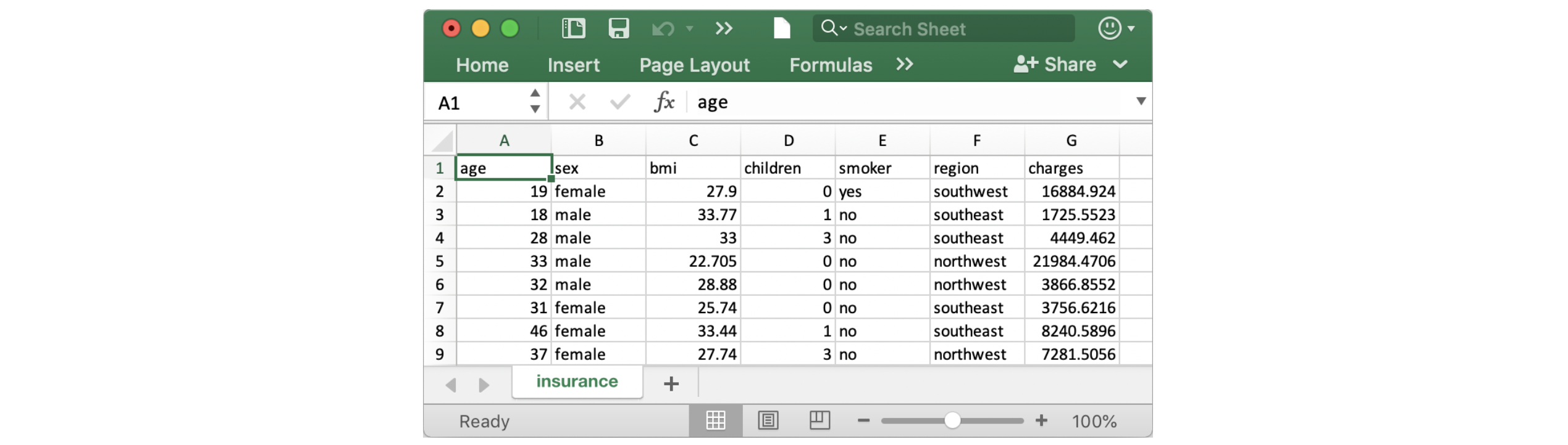
insurance_data.head()| age | sex | bmi | children | smoker | region | charges | |
|---|---|---|---|---|---|---|---|
| 0 | 19 | female | 27.900 | 0 | yes | southwest | 16884.92400 |
| 1 | 18 | male | 33.770 | 1 | no | southeast | 1725.55230 |
| 2 | 28 | male | 33.000 | 3 | no | southeast | 4449.46200 |
| 3 | 33 | male | 22.705 | 0 | no | northwest | 21984.47061 |
| 4 | 32 | male | 28.880 | 0 | no | northwest | 3866.85520 |
Scatter plots
散点图
To create a simple scatter plot, we use the sns.scatterplot command and specify the values for:
要创建简单的散点图,我们使用 sns.scatterplot 命令并指定以下值:
- the horizontal x-axis (
x=insurance_data['bmi']), and - 水平 x 轴 (
x=insurance_data['bmi']),以及 - the vertical y-axis (
y=insurance_data['charges']). - 垂直 y 轴(
y=insurance_data['charges'])。
sns.scatterplot(x=insurance_data['bmi'], y=insurance_data['charges'])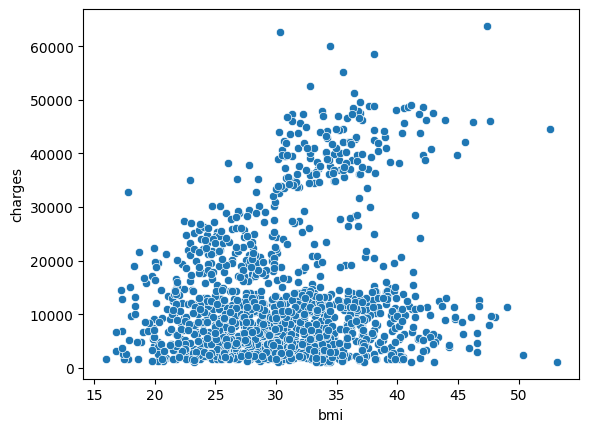
The scatterplot above suggests that body mass index (BMI) and insurance charges are positively correlated, where customers with higher BMI typically also tend to pay more in insurance costs. (This pattern makes sense, since high BMI is typically associated with higher risk of chronic disease.)
上面的散点图表明,体重指数 (BMI) 和保险费用呈正相关,其中 BMI 较高的客户通常也倾向于在保险费用方面支付更多费用 。 (这种模式是有道理的,因为高 BMI 通常与较高的慢性病风险相关。)
To double-check the strength of this relationship, you might like to add a regression line, or the line that best fits the data. We do this by changing the command to sns.regplot.
要仔细检查这种关系的强度,您可能需要添加回归线,或最佳拟合数据的线。 我们通过将命令更改为sns.regplot来做到这一点。
sns.regplot(x=insurance_data['bmi'], y=insurance_data['charges'])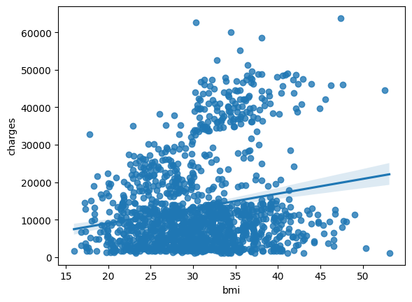
Color-coded scatter plots
颜色编码的散点图
We can use scatter plots to display the relationships between (not two, but...) three variables! One way of doing this is by color-coding the points.
我们可以使用散点图来显示( 不仅是两个,而是...... )三个变量之间的关系! 实现此目的的一种方法是对点进行颜色编码。
For instance, to understand how smoking affects the relationship between BMI and insurance costs, we can color-code the points by 'smoker', and plot the other two columns ('bmi', 'charges') on the axes.
例如,为了了解吸烟如何影响 BMI 和保险费用之间的关系,我们可以通过吸烟者对点进行颜色编码,并将其他两列('bmi', 'charges')绘制在 轴。
sns.scatterplot(x=insurance_data['bmi'], y=insurance_data['charges'], hue=insurance_data['smoker'])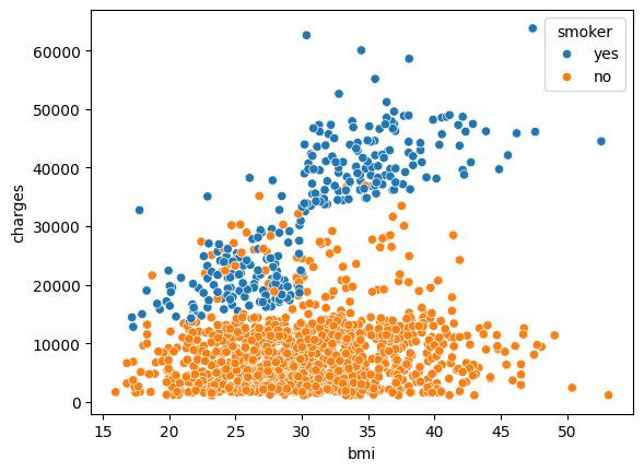
This scatter plot shows that while nonsmokers to tend to pay slightly more with increasing BMI, smokers pay MUCH more.
该散点图显示,虽然不吸烟者倾向于随着体重指数的增加而支付稍高的费用,但吸烟者支付的费用却要高得多。
To further emphasize this fact, we can use the sns.lmplot command to add two regression lines, corresponding to smokers and nonsmokers. (You'll notice that the regression line for smokers has a much steeper slope, relative to the line for nonsmokers!)
为了进一步强调这一事实,我们可以使用 sns.lmplot 命令添加两条回归线,分别对应吸烟者和非吸烟者。 (您会注意到,相对于非吸烟者的回归线,吸烟者的回归线的斜率要陡得多!)
sns.lmplot(x="bmi", y="charges", hue="smoker", data=insurance_data)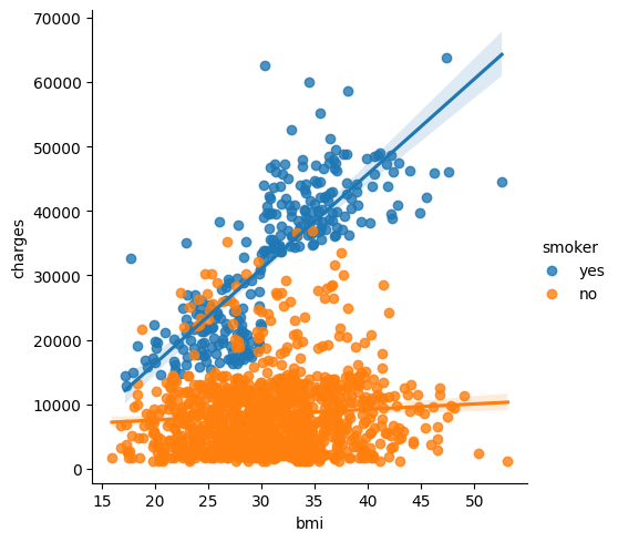
The sns.lmplot command above works slightly differently than the commands you have learned about so far:
上面的 sns.lmplot 命令的工作方式与您目前了解到的命令略有不同:
- Instead of setting
x=insurance_data['bmi']to select the'bmi'column ininsurance_data, we setx="bmi"to specify the name of the column only. - 我们设置
x=insurance_data['bmi']来选择insurance_data中的bmi列,而不是设置x=insurance_data['bmi']来仅指定列的名称。 - Similarly,
y="charges"andhue="smoker"also contain the names of columns. - 同样,
y="charges"和hue="smoker"也包含列的名称。 - We specify the dataset with
data=insurance_data. - 我们用
data=insurance_data指定数据集。
Finally, there's one more plot that you'll learn about, that might look slightly different from how you're used to seeing scatter plots. Usually, we use scatter plots to highlight the relationship between two continuous variables (like "bmi" and "charges"). However, we can adapt the design of the scatter plot to feature a categorical variable (like "smoker") on one of the main axes. We'll refer to this plot type as a categorical scatter plot, and we build it with the sns.swarmplot command.
最后,您将了解另外一个图,它可能与您习惯查看的散点图略有不同。 通常,我们使用散点图来突出显示两个连续变量(例如bmi和charges)之间的关系。 但是,我们可以调整散点图的设计,以在主轴之一上显示分类变量(如吸烟者)。 我们将这种绘图类型称为分类散点图,并使用 sns.swarmplot 命令构建它。
sns.swarmplot(x=insurance_data['smoker'],
              y=insurance_data['charges'],
              size=2.5)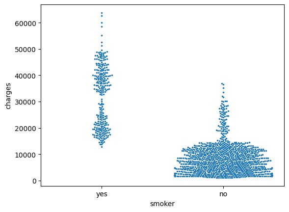
Among other things, this plot shows us that:
除其他事项外,该图向我们表明:
- on average, non-smokers are charged less than smokers, and
- 平均而言,非吸烟者的收费低于吸烟者,并且
- the customers who pay the most are smokers; whereas the customers who pay the least are non-smokers.
- 付钱最多的顾客是吸烟者; 而付钱最少的顾客是非吸烟者。
What's next?
下一步是什么?
Apply your new skills to solve a real-world scenario with a coding exercise!
通过编码练习应用您的新技能来解决现实场景!