In this course, you've learned how to create many different chart types. Now, you'll organize your knowledge, before learning some quick commands that you can use to change the style of your charts.
在本课程中,您学习了如何创建许多不同的图表类型。 现在,您将整理您的知识,然后学习一些可用于更改图表样式的快速命令。
What have you learned?
你已经学到了什么?
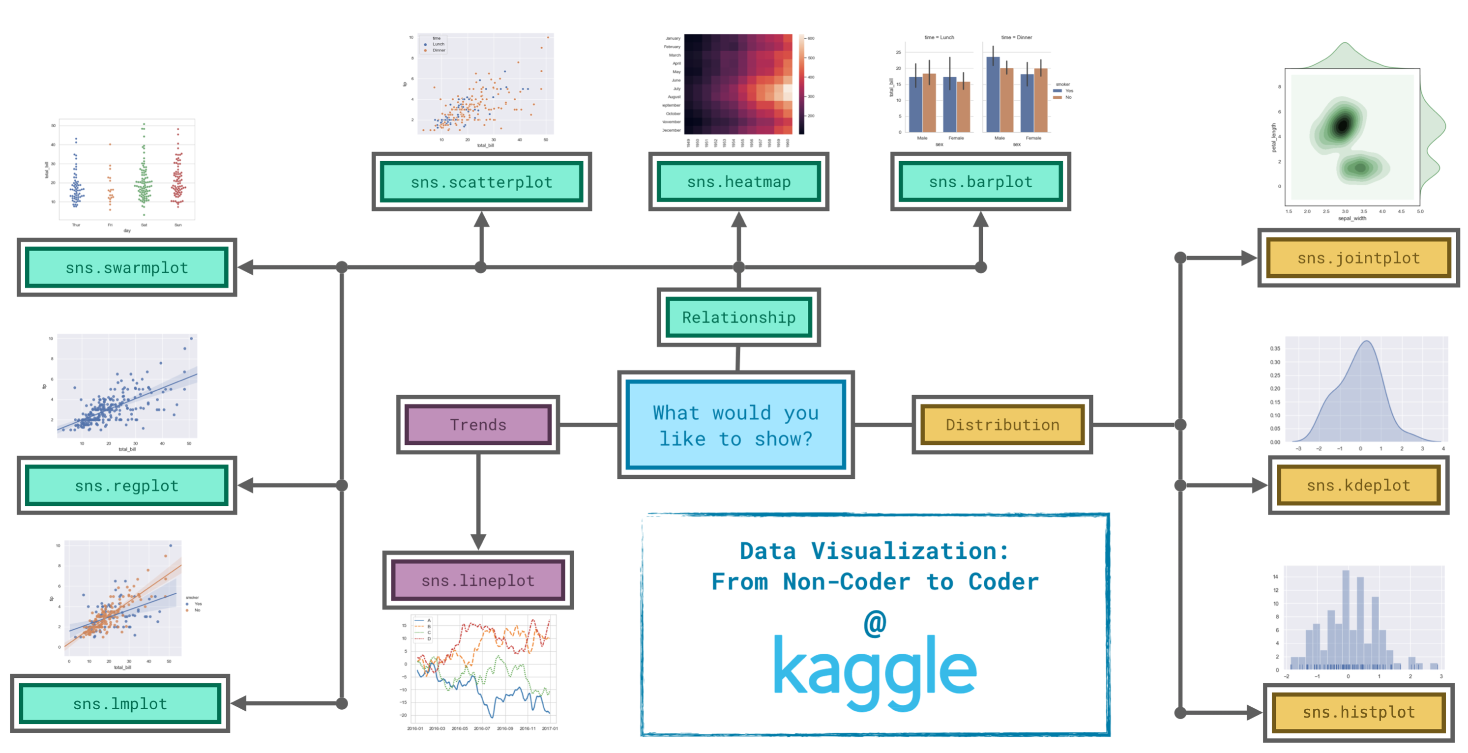
Since it's not always easy to decide how to best tell the story behind your data, we've broken the chart types into three broad categories to help with this.
由于决定如何最好地讲述数据背后的故事并不总是那么容易,因此我们将图表类型分为三大类来帮助解决这一问题。
- Trends - A trend is defined as a pattern of change.
sns.lineplot- Line charts are best to show trends over a period of time, and multiple lines can be used to show trends in more than one group.
- 趋势 - 趋势被定义为一种变化模式。
sns.lineplot- 折线图最能显示一段时间内的趋势,并且可以使用多条线来显示多个组的趋势。
- Relationship - There are many different chart types that you can use to understand relationships between variables in your data.
sns.barplot- Bar charts are useful for comparing quantities corresponding to different groups.sns.heatmap- Heatmaps can be used to find color-coded patterns in tables of numbers.sns.scatterplot- Scatter plots show the relationship between two continuous variables; if color-coded, we can also show the relationship with a third categorical variable.sns.regplot- Including a regression line in the scatter plot makes it easier to see any linear relationship between two variables.sns.lmplot- This command is useful for drawing multiple regression lines, if the scatter plot contains multiple, color-coded groups.sns.swarmplot- Categorical scatter plots show the relationship between a continuous variable and a categorical variable.
- 关系 - 您可以使用许多不同的图表类型来了解数据中变量之间的关系。
sns.barplot- 条形图对于比较不同组对应的数量很有用。sns.heatmap- 热力图可用于在数字表中查找颜色编码模式。sns.scatterplot- 散点图显示两个连续变量之间的关系; 如果用颜色编码,我们还可以显示与第三个分类变量的关系。sns.regplot- 在散点图中包含回归线可以更轻松地查看两个变量之间的任何线性关系。sns.lmplot- 如果散点图包含多个颜色编码组,则此命令对于绘制多条回归线非常有用。sns.swarmplot- 分类散点图显示连续变量和分类变量之间的关系。
- Distribution - We visualize distributions to show the possible values that we can expect to see in a variable, along with how likely they are.
sns.histplot- Histograms show the distribution of a single numerical variable.sns.kdeplot- KDE plots (or 2D KDE plots) show an estimated, smooth distribution of a single numerical variable (or two numerical variables).sns.jointplot- This command is useful for simultaneously displaying a 2D KDE plot with the corresponding KDE plots for each individual variable.
- 分布 - 我们可视化分布以显示我们期望在变量中看到的可能值以及它们的可能性。
sns.histplot- 直方图显示单个数值变量的分布。sns.kdeplot- KDE 图(或 2D KDE 图)显示单个数值变量(或两个数值变量)的估计、平滑分布。sns.jointplot- 此命令对于同时显示 2D KDE 图和每个单独变量的相应 KDE 图非常有用。
Changing styles with seaborn
使用seaborn改变风格
All of the commands have provided a nice, default style to each of the plots. However, you may find it useful to customize how your plots look, and thankfully, this can be accomplished by just adding one more line of code!
所有命令都为每个图提供了一个很好的默认样式。 但是,您可能会发现自定义绘图的外观很有用,值得庆幸的是,只需再添加一行代码即可完成此操作!
As always, we need to begin by setting up the coding environment. (This code is hidden, but you can un-hide it by clicking on the "Code" button immediately below this text, on the right.)
与往常一样,我们需要从设置编码环境开始。 ( 此代码已隐藏,但您可以通过单击该文本右侧紧邻的“代码”按钮来取消隐藏它。 )
import pandas as pd
pd.plotting.register_matplotlib_converters()
import matplotlib.pyplot as plt
%matplotlib inline
import seaborn as sns
print("Setup Complete")
Setup CompleteWe'll work with the same code that we used to create a line chart in a previous tutorial. The code below loads the dataset and creates the chart.
我们将使用与在上一个教程中创建折线图相同的代码。 下面的代码加载数据集并创建图表。
# Path of the file to read
spotify_filepath = "../00 datasets/alexisbcook/data-for-datavis/spotify.csv"

# Read the file into a variable spotify_data
spotify_data = pd.read_csv(spotify_filepath, index_col="Date", parse_dates=True)

# Line chart
plt.figure(figsize=(12,6))
sns.lineplot(data=spotify_data)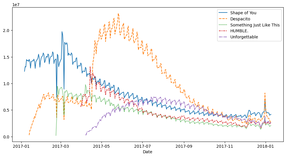
We can quickly change the style of the figure to a different theme with only a single line of code.
我们只需一行代码就可以快速将图形的样式更改为不同的主题。
# Change the style of the figure to the "dark" theme
sns.set_style("dark")

# Line chart
plt.figure(figsize=(12,6))
sns.lineplot(data=spotify_data)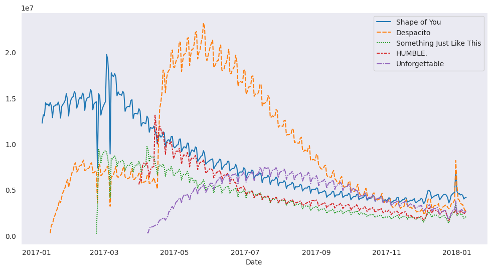
Seaborn has five different themes: (1)"darkgrid", (2)"whitegrid", (3)"dark", (4)"white", and (5)"ticks", and you need only use a command similar to the one in the code cell above (with the chosen theme filled in) to change it.
Seaborn 有五个不同的主题:(1)"darkgrid"、(2)"whitegrid"、(3)"dark"、(4)"white" 和 (5)"ticks" ,您只需使用与上面代码单元中的命令类似的命令(填充所选主题)即可更改它。
In the upcoming exercise, you'll experiment with these themes to see which one you like most!
在接下来的练习中,您将尝试这些主题,看看您最喜欢哪一个!
What's next?
下一步是什么?
Explore seaborn styles in a quick coding exercise!
通过快速编码练习探索seaborn风格!