Congratulations for making it to the end of the course!
恭喜您来到最后一课!
In this final tutorial, you'll learn an efficient workflow that you can use to continue creating your own stunning data visualizations on the Kaggle website.
在这最后一个教程中,您将学习一个高效的工作流程,您可以使用该工作流程继续在 Kaggle 网站上创建您自己的令人惊叹的数据可视化。
Workflow
工作流
Begin by navigating to the site for Kaggle Notebooks:
首先导航到 Kaggle Notebooks 站点:
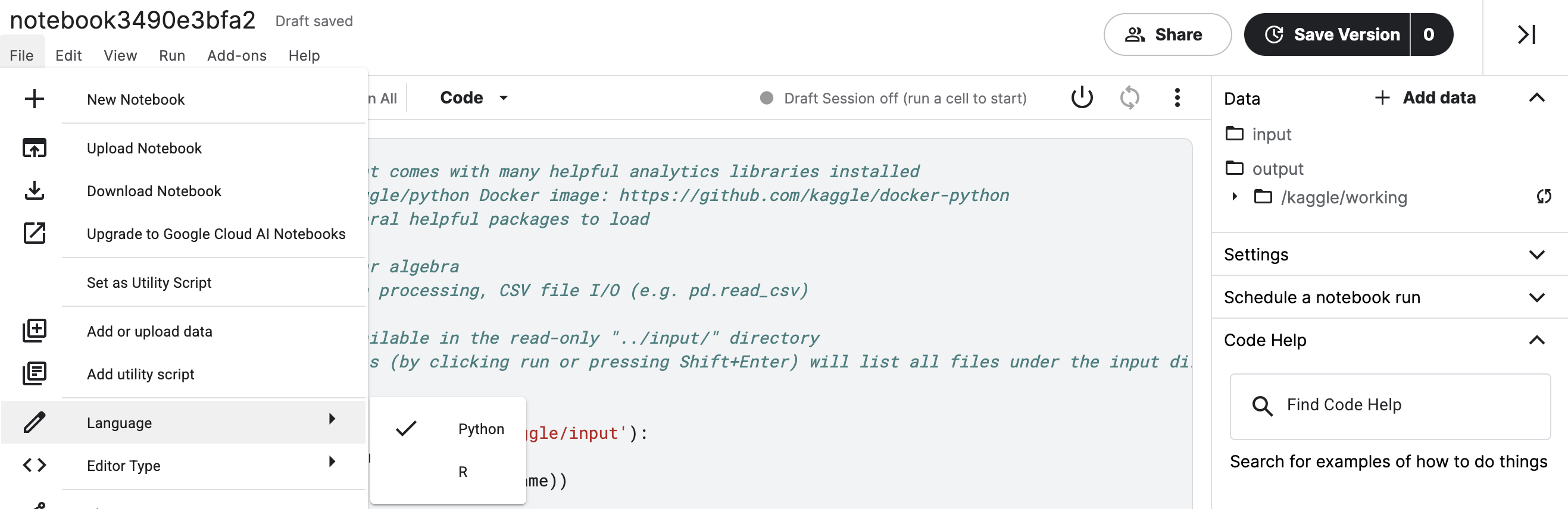
Then, in the top left corner, click on [+ New Notebook].
然后,在左上角,单击 [+ 新笔记本]。
This opens a notebook. As a first step, check the language of the notebook by selecting File > Language. If it's not Python, change the language to Python now.
这将打开一个笔记本。 第一步,通过选择 文件 > 语言 检查笔记本的语言。 如果不是 Python,请立即将语言更改为 Python。
The notebook should hvae some default code. Please erase this code, and replace it with the code in the cell below. (This is the same code that you used in all of the exercises to set up your Python environment.)
笔记本应该有一些默认代码。 请删除此代码,并将其替换为下面单元格中的代码。(这与您在设置 Python 环境的所有练习中使用的代码相同。)
import pandas as pd
pd.plotting.register_matplotlib_converters()
import matplotlib.pyplot as plt
%matplotlib inline
import seaborn as sns
print("Setup Complete")
Setup CompleteThe next step is to attach a dataset, before writing code to visualize it. (You learned how to do that in the previous tutorial.)
下一步是附加数据集,然后编写代码来可视化它。 (您在上一个教程中学习了如何做到这一点。)
Then, once you have generated a figure, you need only save it as an image file that you can easily add to your presentations!
然后,一旦生成了图形,您只需将其保存为图像文件即可轻松添加到演示文稿中!