Time-series plotting (Optional)
时间序列绘图(可选)
In all of the sections thus far our visualizations have focused on and used numeric variables: either categorical variables, which fall into a set of buckets, or interval variables, which fall into an interval of values. In this notebook we will explore another type of variable: a time-series variable.
到目前为止,在所有部分中,我们的可视化都集中在并使用了数字变量:要么是属于一组用桶(buckets)存储的 calcategories 变量,要么是属于一个值区间的区间变量。 在本笔记本中,我们将探索另一种类型的变量:时间序列变量。
import pandas as pd
pd.set_option('display.max_columns', None)
import numpy as np
Types of time series variables
时间序列变量的类型
Time-series variables are populated by values which are specific to a point in time. Time is linear and infinitely fine-grained, so really time-series values are a kind of special case of interval variables.
时间序列变量由特定于某个时间点的值填充。 时间是线性且无限细粒度的,因此时间序列值实际上是区间变量的一种特殊情况。
Dates can show up in your dataset in a few different ways. We'll examine the two most common ways in this notebook.
日期可以通过几种不同的方式显示在数据集中。 我们将在本笔记本中研究两种最常见的方法。
In the "strong case" dates act as an explicit index on your dataset. A good example is the following dataset on stock prices:
在强情况下,日期充当数据集的显式索引。 以下股票价格数据集就是一个很好的例子:
stocks = pd.read_csv("../00 datasets/dgawlik/nyse/prices.csv", parse_dates=['date'], date_format="mixed")
stocks = stocks[stocks['symbol'] == "GOOG"].set_index('date')
stocks.head()| symbol | open | close | low | high | volume | |
|---|---|---|---|---|---|---|
| date | ||||||
| 2010-01-04 | GOOG | 626.951088 | 626.751061 | 624.241073 | 629.511067 | 3927000.0 |
| 2010-01-05 | GOOG | 627.181073 | 623.991055 | 621.541045 | 627.841071 | 6031900.0 |
| 2010-01-06 | GOOG | 625.861078 | 608.261023 | 606.361042 | 625.861078 | 7987100.0 |
| 2010-01-07 | GOOG | 609.401025 | 594.101005 | 592.651008 | 610.001045 | 12876600.0 |
| 2010-01-08 | GOOG | 592.000997 | 602.021036 | 589.110988 | 603.251034 | 9483900.0 |
This dataset which is indexed by the date: the data being collected is being collected in the "period" of a day. The values in the record provide information about that stock within that period.
该数据集按日期索引:正在收集的数据是在一天的时间段内收集的。 记录中的值提供了该期间内该股票的信息。
For daily data like this using a date like this is convenient. But a period can technically be for any length of time. pandas provides a whole dedicated type, the pandas.Period dtype (documented here), for this concept.
对于这样的日常数据,使用这样的日期很方便。 但从技术上讲,一段时间可以是任意长度。对于这个概念 pandas 提供了一个完整的专用类型,pandas.Period dtype (文档在此处)。
In the "weak case", dates act as timestamps: they tell us something about when an observation occurred. For example, in the following dataset of animal shelter outcomes, there are two columns, datetime and date_of_birth, which describe facts about the animal in the observation.
在弱情况下,日期充当时间戳:它们告诉我们有关观察发生时间的信息。 例如,在以下动物收容所结果数据集中,有两个时间列,分别是datetime和date_of_birth,它们描述了观察中动物的事实。
shelter_outcomes = pd.read_csv(
    "../00 datasets/aaronschlegel/austin-animal-center-shelter-outcomes-and/aac_shelter_outcomes.csv",
    parse_dates=['date_of_birth', 'datetime']
)
shelter_outcomes = shelter_outcomes[
    ['outcome_type', 'age_upon_outcome', 'datetime', 'animal_type', 'breed',
     'color', 'sex_upon_outcome', 'date_of_birth']
]
shelter_outcomes.head()| outcome_type | age_upon_outcome | datetime | animal_type | breed | color | sex_upon_outcome | date_of_birth | |
|---|---|---|---|---|---|---|---|---|
| 0 | Transfer | 2 weeks | 2014-07-22 16:04:00 | Cat | Domestic Shorthair Mix | Orange Tabby | Intact Male | 2014-07-07 |
| 1 | Transfer | 1 year | 2013-11-07 11:47:00 | Dog | Beagle Mix | White/Brown | Spayed Female | 2012-11-06 |
| 2 | Adoption | 1 year | 2014-06-03 14:20:00 | Dog | Pit Bull | Blue/White | Neutered Male | 2013-03-31 |
| 3 | Transfer | 9 years | 2014-06-15 15:50:00 | Dog | Miniature Schnauzer Mix | White | Neutered Male | 2005-06-02 |
| 4 | Euthanasia | 5 months | 2014-07-07 14:04:00 | Other | Bat Mix | Brown | Unknown | 2014-01-07 |
To put this another way, the stock data is aggregated over a certain period of time, so changing the time significantly changes the data. In the animal outcomes case, information is "record-level"; the dates are descriptive facts and it doesn't make sense to change them.
换句话说,股票数据是在一定时间段内聚合的,因此更改时间会显着改变数据。 在动物结果案例中,信息是纪录级的; 日期是描述性事实,更改它们没有意义。
Visualizing by grouping
通过分组可视化
I said earlier that time is a "special case" of an interval variable. Does that mean that we can use the tools and techniques familiar to us from earlier sections with time series data as well? Of course!
我之前说过,时间是区间变量的特例。 这是否意味着我们也可以使用前面章节中熟悉的工具和技术来处理时间序列数据? 当然!
For example, here's a line plot visualizing which birth dates are the most common in the dataset.
例如,下面的线图直观地显示了数据集中最常见的出生日期。
# shelter_outcomes['date_of_birth'].value_counts().sort_values().plot.line() # 原文的方法有误
shelter_outcomes['date_of_birth'].value_counts().sort_index().plot.line()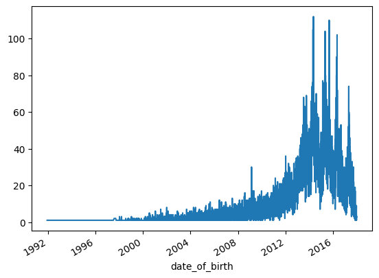
It looks like birth dates for the animals in the dataset peak at around 2015, but it's hard to tell for sure because the data is rather noisy.
数据集中动物的出生日期似乎在 2015 年左右达到峰值,但很难确定,因为数据的噪声相当大。
Currently the data is by day, but what if we globbed all the dates together into years? This is known as resampling. We can do this to tweak the dataset, generating a result that's aggregated by year. The method for doing this in pandas, resample, is pretty simple. There are lots of potential resampling options: we'll use Y, which is short for "year".
目前的数据是按天计算的,但是如果我们将所有日期汇总到年份中会怎样? 这称为重采样。 我们可以这样做来调整数据集,生成按年份汇总的结果。 在pandas的resample中执行此操作的方法非常简单。 有很多潜在的重采样选项:我们将使用Y,它是year的缩写。
# shelter_outcomes['date_of_birth'].value_counts().resample('YE').sum().plot.line()
import matplotlib.pyplot as plt
fig, (ax1, ax2) = plt.subplots(nrows=1, ncols=2, figsize=(10, 5))
ax1.plot(shelter_outcomes['date_of_birth'].value_counts().resample('YE').sum())
ax1.set_title("Resample as Year")
ax2.plot(shelter_outcomes['date_of_birth'].value_counts().resample('ME').sum())
ax2.set_title("Resample as Month")
plt.tight_layout()
plt.show()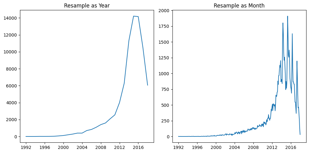
# 第二种画子图的方法
import matplotlib.pyplot as plt
plt.figure(figsize=(10,5))
plt.subplot(1,2,1)
shelter_outcomes['date_of_birth'].value_counts().resample('YE').sum().plot.line()
plt.title("Resample as Year")
plt.subplot(1,2,2)
shelter_outcomes['date_of_birth'].value_counts().resample('ME').sum().plot.line()
plt.title("Resample as Month")
plt.tight_layout()
plt.show()
Much clearer! It looks like, actually, 2014 and 2015 have an almost equal presence in the dataset.
清楚多了! 实际上,2014 年和 2015 年在数据集中的出现次数几乎相同。
This demonstrates the data visualization benefit of resampling: by choosing certain periods you can more clearly visualize certain aspects of the dataset.
这证明了重采样的数据可视化优势:通过选择某些时间段,您可以更清晰地可视化数据集的某些方面。
Notice that pandas is automatically adapting the labels on the x-axis to match our output type. This is because pandas is "datetime-aware"; it knows that when we have data points spaced out one year apart from one another, we only want to see the years in the labels, and nothing else!
请注意,pandas会自动调整 x 轴上的标签以匹配我们的输出类型。 这是因为 pandas 是能够感知日期时间的; 它知道,当我们的数据点彼此间隔一年时,我们只想看到标签中的年份,而不是其他!
Usually the value of time-series data is exposed through this sort of grouping. For example, here's a similar simple bar chart which looks at the trade volume of the GOOG stock:
通常时间序列数据的价值是通过这种分组来体现的。 例如,这是一个类似的简单条形图,用于显示GOOG股票的交易量:
stocks['volume'].resample('YE').mean().plot.bar()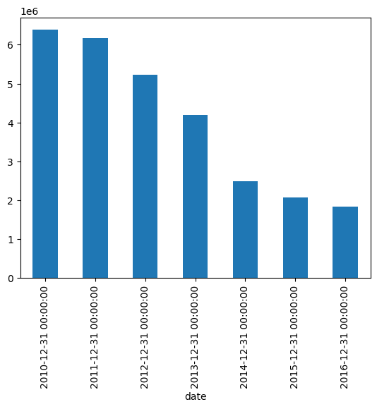
Most of the "new stuff" to using dates in your visualization comes down to a handful of new data processing techniques. Because timestampls are "just" interval variables, understanding date-time data don't require any newfangled visualization techniques!
在可视化中使用日期的大多数新东西都归结为一些新的数据处理技术。 因为时间戳只是区间变量,所以理解日期时间数据不需要任何新奇的可视化技术!
Some new plot types
一些新的绘图类型
Lag plot
滞后图
One of these plot types is the lag plot. A lag plot compares data points from each observation in the dataset against data points from a previous observation. So for example, data from December 21st will be compared with data from December 20th, which will in turn be compared with data from December 19th, and so on. For example, here is what we see when we apply a lag plot to the volume (number of trades conducted) in the stock data:
这些绘图类型之一是滞后图。 滞后图将数据集中每个观测值的数据点与先前观测值的数据点进行比较。 例如,12 月 21 日的数据将与 12 月 20 日的数据进行比较,12 月 20 日的数据又将与 12 月 19 日的数据进行比较,依此类推。 例如,当我们将滞后图应用于股票数据中的交易量(进行的交易数量)时,我们会看到以下结果:
from pandas.plotting import lag_plot

# lag_plot(stocks['volume'])
lag_plot(stocks['volume'].tail(250))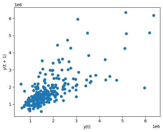
It looks like days when volume is high are somewhat correlated with one another. A day of frantic trading does somewhat signal that the next day will also involve frantic trading.
看起来成交量高的日子之间有一定的相关性。 一天的疯狂交易确实在某种程度上预示着第二天也将出现疯狂的交易。【图形能看出这个么?】
Time-series data tends to exhibit a behavior called periodicity: rises and peaks in the data that are correlated with time. For example, a gym would likely see an increase in attendance at the end of every workday, hence exhibiting a periodicity of a day. A bar would likely see a bump in sales on Friday, exhibiting periodicity over the course of a week. And so on.
时间序列数据往往表现出一种称为周期性的行为:数据的上升和峰值与时间相关。 例如,健身房可能会在每个工作日结束时看到出勤率的增加,因此表现出一天的周期性; 酒吧周五的销售额可能会有所增加,并在一周内呈现出周期性;等等。
Lag plots are extremely useful because they are a simple way of checking datasets for this kind of periodicity.
滞后图非常有用,因为它们是检查数据集的这种周期性的简单方法。
Note that they only work on "strong case" timeseries data.
请注意,它们仅适用于强情况下时间序列数据。
Autocorrelation plot
自相关图
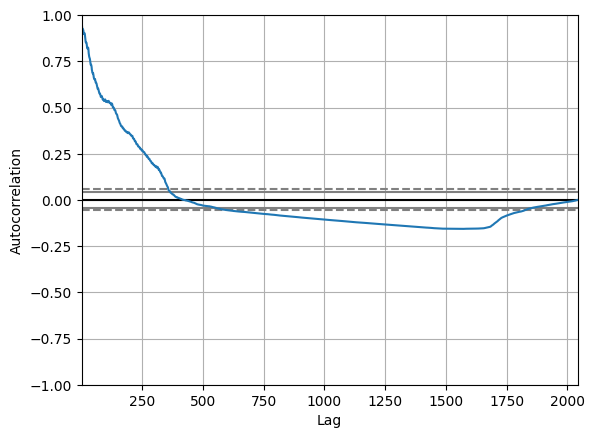
A plot type that takes this concept and goes even further with it is the autocorrelation plot. The autocorrelation plot is a multivariate summarization-type plot that lets you check every periodicity at the same time. It does this by computing a summary statistic——the correlation score——across every possible lag in the dataset. This is known as autocorrelation.
采用这一概念并进一步发展的绘图类型是自相关图。 自相关图是一种多元汇总型图,可让您同时检查每个周期性。 它通过计算数据集中每个可能的滞后的汇总统计数据(相关性得分)来实现这一点。 这称为自相关。
In an autocorrelation plot the lag is on the x-axis and the autocorrelation score is on the y-axis. The farther away the autocorrelation is from 0, the greater the influence that records that far away from each other exert on one another.
在自相关图中,滞后位于 x 轴上,自相关得分位于 y 轴上。 自相关距离0越远,距离较远的记录对彼此的影响就越大。
Here is what an autocorrelation plot looks like when applied to the stock volume data:
以下是将自相关图应用于股票成交量数据时的样子:
from pandas.plotting import autocorrelation_plot

autocorrelation_plot(stocks['volume'])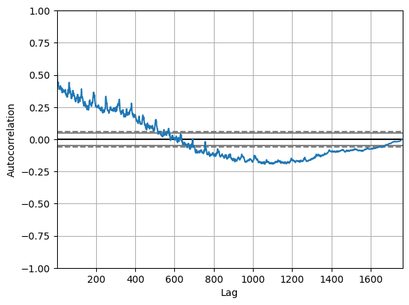
It seems like the volume of trading activity is weakly descendingly correlated with trading volume from the year prior. There aren't any significant non-random peaks in the dataset, so this is good evidence that there isn't much of a time-series pattern to the volume of trade activity over time.
交易成交量似乎与上一年的交易量呈弱下降相关。 数据集中没有任何显著的非随机峰值,因此这是一个很好的证据,表明随着时间的推移,贸易活动量没有太多的时间序列模式。
Of course, in this short optional section we're only scratching the surface of what you can do with do with time-series data. There's an entire literature around how to work with time-series variables that we are not discussing here. But these are the basics, and hopefully enough to get you started analyzing your own time-dependent data!
当然,在这个简短的可选部分中,我们仅触及您可以对时间序列数据执行的操作的表面。 关于如何使用时间序列变量有完整的文献,我们在这里不讨论。 但这些是基础知识,希望足以让您开始分析自己的时间相关数据!
Exercises
import pandas as pd

crypto = pd.read_csv("../00 datasets/jessevent/all-crypto-currencies/crypto-markets.csv")
crypto = crypto[crypto['name'] == 'Bitcoin']
crypto['date'] = pd.to_datetime(crypto['date'])
crypto.head()| slug | symbol | name | date | ranknow | open | high | low | close | volume | market | close_ratio | spread | |
|---|---|---|---|---|---|---|---|---|---|---|---|---|---|
| 0 | bitcoin | BTC | Bitcoin | 2013-04-28 | 1 | 135.30 | 135.98 | 132.10 | 134.21 | 0.0 | 1.488567e+09 | 0.5438 | 3.88 |
| 1 | bitcoin | BTC | Bitcoin | 2013-04-29 | 1 | 134.44 | 147.49 | 134.00 | 144.54 | 0.0 | 1.603769e+09 | 0.7813 | 13.49 |
| 2 | bitcoin | BTC | Bitcoin | 2013-04-30 | 1 | 144.00 | 146.93 | 134.05 | 139.00 | 0.0 | 1.542813e+09 | 0.3843 | 12.88 |
| 3 | bitcoin | BTC | Bitcoin | 2013-05-01 | 1 | 139.00 | 139.89 | 107.72 | 116.99 | 0.0 | 1.298955e+09 | 0.2882 | 32.17 |
| 4 | bitcoin | BTC | Bitcoin | 2013-05-02 | 1 | 116.38 | 125.60 | 92.28 | 105.21 | 0.0 | 1.168517e+09 | 0.3881 | 33.32 |
Try answering the following questions. Click the "Output" button on the cell below to see the answers.
尝试回答以下问题。 单击下面单元格上的输出按钮即可查看答案。
- Time-series variables are really a special case of what other type of variable?
- 时间序列变量确实是其他类型变量的特例么?
- Why is resampling useful in a data visualization context?
- 为什么重采样在数据可视化环境中有用?
- What is lag? What is autocorrelation?
- 什么是滞后? 什么是自相关?
from IPython.display import HTML

HTML("""
<ol>
<li>Time-series data is really a special case of interval data.</li>
<br/>
<li>时间序列数据实际上是区间数据的特例。</li>
<br>
<li>Resampling is often useful in data visualization because it can help clean up and denoise our plots by aggregating on a different level.</li>
<br/>
<li>重采样在数据可视化中通常很有用,因为它可以通过在不同级别上聚合来帮助清理和降噪我们的绘图。</li>
<br/>
<li>Lag is the time-difference for each observation in the dataset. Autocorrelation is correlation applied to lag.</li>
<li>滞后是数据集中每个观测值的时间差。 自相关是应用于滞后的相关性。</li>
</ol>
""")- Time-series data is really a special case of interval data.
- 时间序列数据实际上是区间数据的特例。
- Resampling is often useful in data visualization because it can help clean up and denoise our plots by aggregating on a different level.
- 重采样在数据可视化中通常很有用,因为它可以通过在不同级别上聚合来帮助清理和降噪我们的绘图。
- Lag is the time-difference for each observation in the dataset. Autocorrelation is correlation applied to lag.
- 滞后是数据集中每个观测值的时间差。 自相关是应用于滞后的相关性。
For the exercises that follow, try forking this notebook and replicating the plots that follow. To see the answers, hit the "Input" button below to un-hide the code.
对于下面的练习,请尝试复制此笔记本并复制下面的图。 要查看答案,请点击下面的输入按钮以取消隐藏代码。
A line chart depicting the datetime column in shelter_outcomes aggregated by year.
折线图描绘了shelter_outcomes中按年份汇总的datetime列。
shelter_outcomes['datetime'].value_counts().resample('YE').count().plot.line()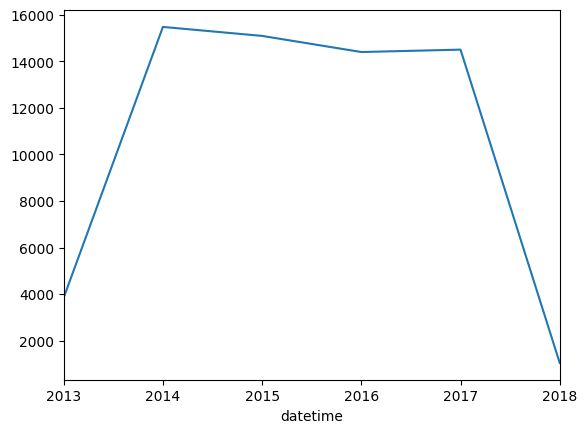
A lag plot of cryptocurrency (crypto) trading volume from the last 250 days (hint: use tail).
过去 250 天的加密货币(crypto)交易交易量的滞后图(提示:使用tail)。
lag_plot(crypto['volume'].tail(250))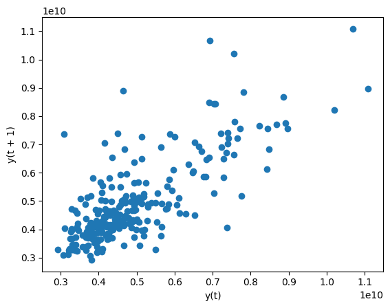
An autocorrelation plot of cryptocurrency (crypto) trading volume.
加密货币(crypto)交易交易量的自相关图。
autocorrelation_plot(crypto['volume'])