Partial Dependence Plots
部分依赖图
While feature importance shows what variables most affect predictions, partial dependence plots show how a feature affects predictions.
虽然特征重要性显示了哪些变量对预测影响最大,但部分依赖图显示了特征如何影响预测。
This is useful to answer questions like:
这对于回答以下问题很有用:
-
Controlling for all other house features, what impact do longitude and latitude have on home prices? To restate this, how would similarly sized houses be priced in different areas?
-
控制所有其他房屋特征,经度和纬度对房价有何影响?重申一下,不同地区类似大小的房屋价格如何?
-
Are predicted health differences between two groups due to differences in their diets, or due to some other factor?
-
两组之间预测的健康差异是由于饮食差异还是由于其他因素?
If you are familiar with linear or logistic regression models, partial dependence plots can be interpreted similarly to the coefficients in those models. Though, partial dependence plots on sophisticated models can capture more complex patterns than coefficients from simple models. If you aren't familiar with linear or logistic regressions, don't worry about this comparison.
如果您熟悉线性或逻辑回归模型,则可以像解释这些模型中的系数一样解释部分依赖图。但是,复杂模型上的部分依赖图可以比简单模型中的系数捕捉到更复杂的模式。如果您不熟悉线性或逻辑回归,请不要担心这种比较。
We will show a couple examples, explain the interpretation of these plots, and then review the code to create these plots.
我们将展示几个示例,解释这些图的解释,然后查看创建这些图的代码。
How it Works
工作原理
Like permutation importance, partial dependence plots are calculated after a model has been fit. The model is fit on real data that has not been artificially manipulated in any way.
与置换重要性一样,部分依赖图是在模型拟合后计算的。 该模型基于未经任何方式人为操纵的真实数据进行拟合。
In our soccer example, teams may differ in many ways. How many passes they made, shots they took, goals they scored, etc. At first glance, it seems difficult to disentangle the effect of these features.
在我们的足球示例中,球队可能在很多方面有所不同。他们传球、射门、进球等。乍一看,似乎很难理清这些特征的影响。
To see how partial plots separate out the effect of each feature, we start by considering a single row of data. For example, that row of data might represent a team that had the ball 50% of the time, made 100 passes, took 10 shots and scored 1 goal.
要了解部分图如何分离出每个特征的影响,我们首先考虑一行数据。例如,该行数据可能代表一支球队,该球队 50% 的时间控球,传球 100 次,射门 10 次,进球 1 个。
We will use the fitted model to predict our outcome (probability their player won "man of the match"). But we repeatedly alter the value for one variable to make a series of predictions. We could predict the outcome if the team had the ball only 40% of the time. We then predict with them having the ball 50% of the time. Then predict again for 60%. And so on. We trace out predicted outcomes (on the vertical axis) as we move from small values of ball possession to large values (on the horizontal axis).
我们将使用拟合模型来预测我们的结果(他们的球员赢得“最佳球员”的概率)。但我们反复改变一个变量的值以做出一系列预测。如果球队只有 40% 的时间控球,我们可以预测结果。然后我们预测他们有 50% 的时间控球。然后再次预测 60%。依此类推。随着控球率从小值移到大值(横轴),我们追踪预测结果(纵轴)。
In this description, we used only a single row of data. Interactions between features may cause the plot for a single row to be atypical. So, we repeat that mental experiment with multiple rows from the original dataset, and we plot the average predicted outcome on the vertical axis.
在此描述中,我们仅使用一行数据。特征之间的相互作用可能会导致单行图不典型。因此,我们用原始数据集中的多行重复该心理实验,并在纵轴上绘制平均预测结果。
Code Example
代码示例
Model building isn't our focus, so we won't focus on the data exploration or model building code.
模型构建不是我们的重点,所以我们不会关注数据探索或模型构建代码。
import numpy as np
import pandas as pd
from sklearn.model_selection import train_test_split
from sklearn.ensemble import RandomForestClassifier
from sklearn.tree import DecisionTreeClassifier

data = pd.read_csv('../input/fifa-2018-match-statistics/FIFA 2018 Statistics.csv')
y = (data['Man of the Match'] == "Yes")  # Convert from string "Yes"/"No" to binary
feature_names = [i for i in data.columns if data[i].dtype in [np.int64]]
X = data[feature_names]
train_X, val_X, train_y, val_y = train_test_split(X, y, random_state=1)
tree_model = DecisionTreeClassifier(random_state=0, max_depth=5, min_samples_split=5).fit(train_X, train_y)
Our first example uses a decision tree, which you can see below. In practice, you'll use more sophistated models for real-world applications.
我们的第一个示例使用决策树,如下所示。实际上,您将在实际应用中使用更复杂的模型。
from sklearn import tree
import graphviz

tree_graph = tree.export_graphviz(tree_model, out_file=None, feature_names=feature_names)
graphviz.Source(tree_graph)
As guidance to read the tree:
以下是理解树的指导:
- Leaves with children show their splitting criterion on the top
- 带有子节点的叶子在顶部显示其分裂标准
- The pair of values at the bottom show the count of False values and True values for the target respectively, of data points in that node of the tree.
- 底部的一对值分别显示树中该节点数据点的目标假值和真值的数量。
Here is the code to create the Partial Dependence Plot using the scikit-learn library.
以下是使用 scikit-learn 库创建部分依赖图的代码。
from matplotlib import pyplot as plt
from sklearn.inspection import PartialDependenceDisplay

# Create and plot the data
disp1 = PartialDependenceDisplay.from_estimator(tree_model, val_X, ['Goal Scored'])
plt.show()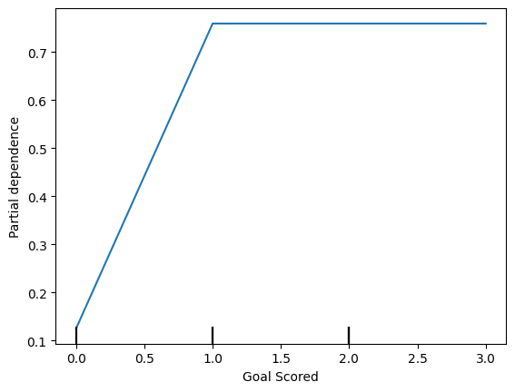
The y axis is interpreted as change in the prediction from what it would be predicted at the baseline or leftmost value.
y 轴被解释为预测的变化,与基线或最左边的预测值不同。
From this particular graph, we see that scoring a goal substantially increases your chances of winning "Man of The Match." But extra goals beyond that appear to have little impact on predictions.
从这个特定的图表中,我们可以看出进球大大增加了你赢得“本场最佳球员”的机会。但除此之外的额外进球似乎对预测影响不大。
Here is another example plot:
这是另一个示例图:
feature_to_plot = 'Distance Covered (Kms)'
disp2 = PartialDependenceDisplay.from_estimator(tree_model, val_X, [feature_to_plot])
plt.show()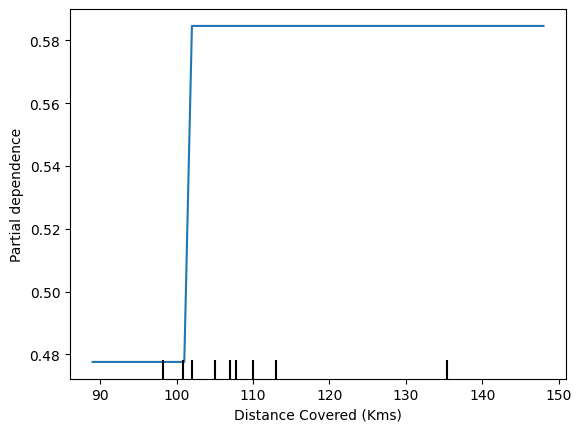
This graph seems too simple to represent reality. But that's because the model is so simple. You should be able to see from the decision tree above that this is representing exactly the model's structure.
该图似乎过于简单,无法代表现实。但这是因为模型太简单了。您应该能够从上面的决策树中看到,这恰恰代表了模型的结构。
You can easily compare the structure or implications of different models. Here is the same plot with a Random Forest model.
您可以轻松比较不同模型的结构或含义。这是使用随机森林模型所画出的相同图。
# Build Random Forest model
rf_model = RandomForestClassifier(random_state=0).fit(train_X, train_y)

disp3 = PartialDependenceDisplay.from_estimator(rf_model, val_X, [feature_to_plot])
plt.show()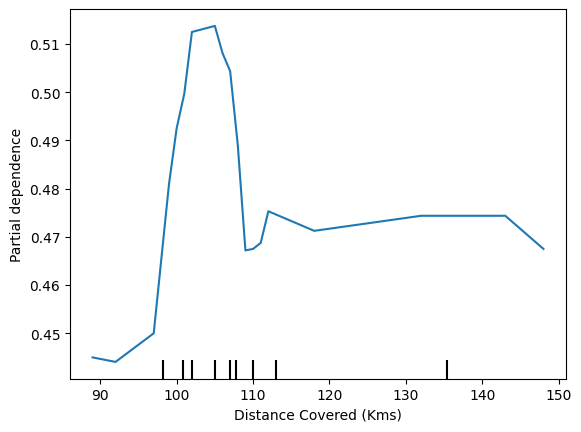
This model thinks you are more likely to win Man of the Match if your players run a total of 100km over the course of the game. Though running much more causes lower predictions.
该模型认为,如果您的球员在比赛过程中总共跑了 100 公里,您就更有可能赢得最佳球员。尽管跑得更多会导致预测值更低。
In general, the smooth shape of this curve seems more plausible than the step function from the Decision Tree model. Though this dataset is small enough that we would be careful in how we interpret any model.
总体而言,该曲线的平滑形状似乎比决策树模型的阶跃函数更合理。但是这个数据集太小,所以我们在解释任何模型时都要小心谨慎。
2D Partial Dependence Plots
2D 部分依赖图
If you are curious about interactions between features, 2D partial dependence plots are also useful. An example may clarify this.
如果您对特征之间的相互作用感到好奇,2D 部分依赖图也很有用。一个例子可以阐明这一点。
We will again use the Decision Tree model for this graph. It will create an extremely simple plot, but you should be able to match what you see in the plot to the tree itself.
我们将再次使用决策树模型来绘制此图。它将创建一个非常简单的图,但您应该能够将您在图中看到的内容与树本身进行匹配。
fig, ax = plt.subplots(figsize=(8, 6))
f_names = [('Goal Scored', 'Distance Covered (Kms)')]
# Similar to previous PDP plot except we use tuple of features instead of single feature
disp4 = PartialDependenceDisplay.from_estimator(tree_model, val_X, f_names, ax=ax)
plt.show()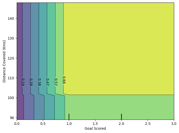
This graph shows predictions for any combination of Goals Scored and Distance covered.
此图显示了进球数和跑动距离的任意组合的预测。
For example, we see the highest predictions when a team scores at least 1 goal and they run a total distance close to 100km. If they score 0 goals, distance covered doesn't matter. Can you see this by tracing through the decision tree with 0 goals?
例如,当一支球队至少进 1 球并且跑动总距离接近 100 公里时,我们看到最高的预测。如果他们进 0 球,跑动距离就无关紧要了。你能通过追踪进球数为 0 的决策树看到这一点吗?
But distance can impact predictions if they score goals. Make sure you can see this from the 2D partial dependence plot. Can you see this pattern in the decision tree too?
但是如果他们进球,距离会影响预测。确保你能从 2D 部分依赖图中看到这一点。你能在决策树中看到这种模式吗?
Your Turn
轮到你了
Test your understanding on conceptual questions and a short coding challenge.