Recap
回顾
We started by learning about permutation importance and partial dependence plots for an overview of what the model has learned.
我们首先学习了排列重要性和部分依赖性图,以概述所学到的模型内容。
We then learned about SHAP values to break down the components of individual predictions.
然后,我们学习了 SHAP 值,以分解各个预测的组成部分。
Now we'll expand on SHAP values, seeing how aggregating many SHAP values can give more detailed alternatives to permutation importance and partial dependence plots.
现在,我们将扩展 SHAP 值,了解如何聚合多个 SHAP 值可以为排列重要性和部分依赖性图提供更详细的替代方案。
SHAP Values Review
SHAP 值回顾
Shap values show how much a given feature changed our prediction (compared to if we made that prediction at some baseline value of that feature).
SHAP 值显示给定特征对我们的预测的改变程度(与我们在该特征的某个基线值处做出该预测相比)。
For example, consider an ultra-simple model:
例如,考虑一个超简单模型:
$$y = 4 x1 + 2 x2$$
If $x1$ takes the value 2, instead of a baseline value of 0, then our SHAP value for $x1$ would be 8 (from 4 times 2).
如果 $x1$ 取值为 2,而不是基线值 0,那么 $x1$ 的 SHAP 值将为 8(由 4 乘以 2 得出)。
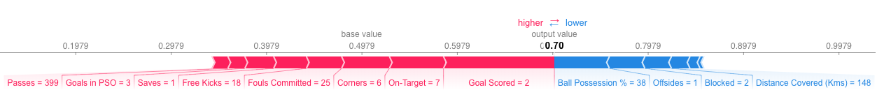
These are harder to calculate with the sophisticated models we use in practice. But through some algorithmic cleverness, Shap values allow us to decompose any prediction into the sum of effects of each feature value, yielding a graph like this:
在我们实际使用的复杂模型中,这些值更难计算。但通过一些巧妙的算法,SHAP 值允许我们将任何预测分解为每个特征值的影响总和,从而得到如下图所示:
In addition to this nice breakdown for each prediction, the Shap library offers great visualizations of groups of Shap values. We will focus on two of these visualizations. These visualizations have conceptual similarities to permutation importance and partial dependence plots. So multiple threads from the previous exercises will come together here.
除了对每个预测进行这种很好的细分之外,SHAP 库 还提供了 SHAP 值组的出色可视化。我们将重点介绍其中两个可视化。这些可视化在概念上与排列重要性和部分依赖性图相似。因此,前面练习中的多个线程将在这里汇集在一起。
Summary Plots
总结图
Permutation importance is great because it created simple numeric measures to see which features mattered to a model. This helped us make comparisons between features easily, and you can present the resulting graphs to non-technical audiences.
排列重要性 很棒,因为它创建了简单的数字度量来查看哪些特征对模型很重要。这有助于我们轻松地对特征进行比较,并且您可以将生成的图表呈现给非技术受众。
But it doesn't tell you how each features matter. If a feature has medium permutation importance, that could mean it has
但它并没有告诉您每个特征的重要性。如果一个特征具有中等排列重要性,则可能意味着它
- a large effect for a few predictions, but no effect in general, or
- 对一些预测有很大的影响,但总体上没有影响,或者
- a medium effect for all predictions.
- 对所有预测都有中等影响。
SHAP summary plots give us a birds-eye view of feature importance and what is driving it. We'll walk through an example plot for the soccer data:
SHAP 总结图让我们可以鸟瞰特征重要性及其驱动因素。我们将介绍足球数据的示例图:
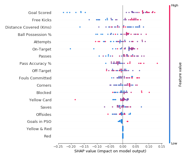
This plot is made of many dots. Each dot has three characteristics:
该图由许多点组成。每个点都有三个特征:
- Vertical location shows what feature it is depicting
- 垂直位置显示它所描绘的特征
- Color shows whether that feature was high or low for that row of the dataset
- 颜色显示该特征对于数据集的该行是高还是低
- Horizontal location shows whether the effect of that value caused a higher or lower prediction.
- 水平位置显示该值的影响是否导致预测值更高或更低。
For example, the point in the upper left was for a team that scored few goals, reducing the prediction by 0.25.
例如,左上角的点代表一支进球少的球队,将预测值降低了 0.25。
Some things you should be able to easily pick out:
您应该能够轻松挑选出一些东西:
- The model ignored the
RedandYellow & Redfeatures. - 该模型忽略了
红色和黄色和红色特征。 - Usually
Yellow Carddoesn't affect the prediction, but there is an extreme case where a high value caused a much lower prediction. - 通常
黄牌不会影响预测,但在极端情况下,高值会导致预测值低得多。 - High values of Goal scored caused higher predictions, and low values caused low predictions
- 进球得分高值导致预测值更高,进球得分低值导致预测值低
If you look for long enough, there's a lot of information in this graph. You'll face some questions to test how you read them in the exercise.
如果您看得足够久,这张图中会有很多信息。您将面临一些问题来测试您在练习中如何阅读它们。
Summary Plots in Code
代码中的摘要图
You have already seen the code to load the soccer/football data:
您已经看到了加载足球数据的代码:
import numpy as np
import pandas as pd
from sklearn.model_selection import train_test_split
from sklearn.ensemble import RandomForestClassifier

data = pd.read_csv('../input/fifa-2018-match-statistics/FIFA 2018 Statistics.csv')
y = (data['Man of the Match'] == "Yes")  # Convert from string "Yes"/"No" to binary
feature_names = [i for i in data.columns if data[i].dtype in [np.int64, np.int64]]
X = data[feature_names]
train_X, val_X, train_y, val_y = train_test_split(X, y, random_state=1)
my_model = RandomForestClassifier(random_state=0).fit(train_X, train_y)
We get the SHAP values for all validation data with the following code. It is short enough that we explain it in the comments.
我们使用以下代码获取所有验证数据的 SHAP 值。它很短,我们在评论中进行了解释。
import shap  # package used to calculate Shap values

# Create object that can calculate shap values
explainer = shap.TreeExplainer(my_model)

# calculate shap values. This is what we will plot.
# Calculate shap_values for all of val_X rather than a single row, to have more data for plot.
shap_values = explainer.shap_values(val_X)

# Make plot. Index of [1] is explained in text below.
shap.summary_plot(shap_values[1], val_X)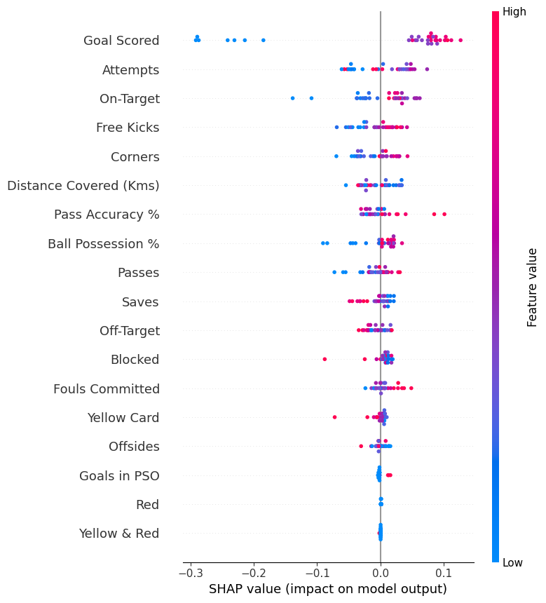
The code isn't too complex. But there are a few caveats.
代码并不太复杂。但有一些注意事项。
- When plotting, we call
shap_values[1]. For classification problems, there is a separate array of SHAP values for each possible outcome. In this case, we index in to get the SHAP values for the prediction of "True". - 绘图时,我们调用
shap_values[1]。对于分类问题,每个可能的结果都有一个单独的 SHAP 值数组。在这种情况下,我们索引以获取预测为“True”的 SHAP 值。 - Calculating SHAP values can be slow. It isn't a problem here, because this dataset is small. But you'll want to be careful when running these to plot with reasonably sized datasets. The exception is when using an
xgboostmodel, which SHAP has some optimizations for and which is thus much faster. - 计算 SHAP 值可能很慢。这不是问题,因为这个数据集很小。但是,在运行这些以使用合理大小的数据集进行绘图时,您需要小心。例外情况是使用
xgboost模型时,SHAP 对其进行了一些优化,因此速度要快得多。
This provides a great overview of the model, but we might want to delve into a single feature. That's where SHAP dependence contribution plots come into play.
这提供了对模型的一个很好的概述,但我们可能想要深入研究一个特征。这就是 SHAP 依赖贡献图发挥作用的地方。
SHAP Dependence Contribution Plots
SHAP 依赖贡献图
We've previously used Partial Dependence Plots to show how a single feature impacts predictions. These are insightful and relevant for many real-world use cases. Plus, with a little effort, they can be explained to a non-technical audience.
我们之前使用过部分依赖图来展示单个特征如何影响预测。这些对于许多实际用例来说都是有见地且相关的。此外,只要稍加努力,它们就可以向非技术受众解释清楚。
But there's a lot they don't show. For instance, what is the distribution of effects? Is the effect of having a certain value pretty constant, or does it vary a lot depending on the values of other feaures. SHAP dependence contribution plots provide a similar insight to PDP's, but they add a lot more detail.
但它们没有展示很多内容。例如,效果的分布是什么?某个值的效果是否相当稳定,还是会根据其他特征的值而有很大变化。SHAP 依赖性贡献图提供了与 PDP 类似的见解,但它们增加了更多细节。
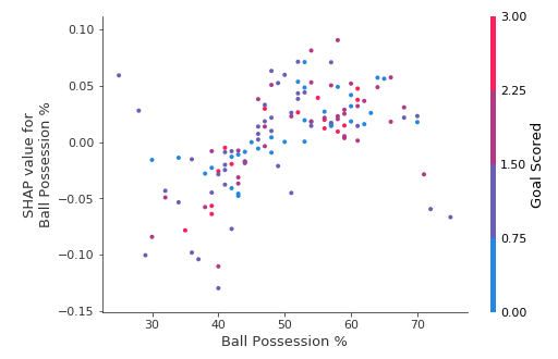
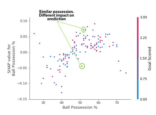
Start by focusing on the shape, and we'll come back to color in a minute. Each dot represents a row of the data. The horizontal location is the actual value from the dataset, and the vertical location shows what having that value did to the prediction. The fact this slopes upward says that the more you possess the ball, the higher the model's prediction is for winning the Man of the Match award.
首先关注形状,稍后我们再讨论颜色。每个点代表一行数据。水平位置是数据集中的实际值,垂直位置显示该值对预测的影响。向上倾斜的事实表明,你控球越多,模型对赢得 最佳球员 奖的预测就越高。
The spread suggests that other features must interact with Ball Possession %. For example, here we have highlighted two points with similar ball possession values. That value caused one prediction to increase, and it caused the other prediction to decrease.
分布表明其他特征必须与控球率相互作用。例如,这里我们突出显示了两个控球率相似的点。该值导致一个预测增加,并导致另一个预测减少。
For comparison, a simple linear regression would produce plots that are perfect lines, without this spread.
相比之下,简单的线性回归会产生完美的线条图,而没有这种扩散。
This suggests we delve into the interactions, and the plots include color coding to help do that. While the primary trend is upward, you can visually inspect whether that varies by dot color.
这表明我们深入研究了相互作用,并且这些图包括颜色编码来帮助做到这一点。虽然主要趋势是向上的,但您可以目视检查这是否因点颜色而异。
Consider the following very narrow example for concreteness.
为了具体起见,请考虑以下非常狭窄的示例。
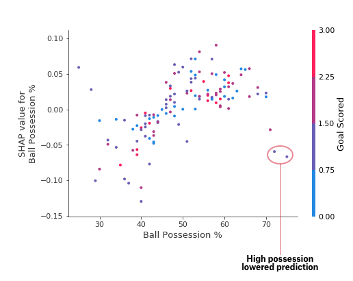
These two points stand out spatially as being far away from the upward trend. They are both colored purple, indicating the team scored one goal. You can interpret this to say In general, having the ball increases a team's chance of having their player win the award. But if they only score one goal, that trend reverses and the award judges may penalize them for having the ball so much if they score that little.
这两个点在空间上很突出,远离上升趋势。它们都呈紫色,表示球队进了一个球。你可以将其解释为 一般来说,控球会增加球队球员赢得奖项的机会。但如果他们只进了一个球,那么这种趋势就会逆转,如果得分太少,奖项评委可能会因为他们控球太多而惩罚他们。
Outside of those few outliers, the interaction indicated by color isn't very dramatic here. But sometimes it will jump out at you.
除了这几个异常值外,颜色表示的相互作用在这里并不十分引人注目。但有时它会跳出来。
Dependence Contribution Plots in Code
代码中的依赖贡献图
We get the dependence contribution plot with the following code. The only line that's different from the summary_plot is the last line.
我们使用以下代码获得依赖贡献图。唯一与summary_plot不同的行是最后一行。
import shap  # package used to calculate Shap values

# Create object that can calculate shap values
explainer = shap.TreeExplainer(my_model)

# calculate shap values. This is what we will plot.
shap_values = explainer.shap_values(X)

# make plot.
shap.dependence_plot('Ball Possession %', shap_values[1], X, interaction_index="Goal Scored")
If you don't supply an argument for interaction_index, Shapley uses some logic to pick one that may be interesting.
如果您没有为interaction_index提供参数,Shapley 会使用某种逻辑来选择一个可能有趣的参数。
This didn't require writing a lot of code. But the trick with these techniques is in thinking critically about the results rather than writing code itself.
这不需要编写大量代码。但这些技术的诀窍在于批判性地思考结果,而不是编写代码本身。
Your Turn
轮到你了
Test yourself with some questions to develop your skill with these techniques.
测试一下自己 ,用一些问题来提高你使用这些技术的技能。