This notebook is an exercise in the Machine Learning Explainability course. You can reference the tutorial at this link.
Set Up
设置
We have again provided code to do the basic loading, review and model-building. Run the cell below to set everything up:
我们再次提供了代码来执行基本的加载、审查和模型构建。运行下面的单元格来设置一切:
import numpy as np
import pandas as pd
from sklearn.ensemble import RandomForestRegressor
from sklearn.model_selection import train_test_split
import shap

# Environment Set-Up for feedback system.
from learntools.core import binder
binder.bind(globals())
from learntools.ml_explainability.ex5 import *
print("Setup Complete")

import pandas as pd
from sklearn.ensemble import RandomForestClassifier
from sklearn.model_selection import train_test_split

data = pd.read_csv('../input/hospital-readmissions/train.csv')
y = data.readmitted
base_features = ['number_inpatient', 'num_medications', 'number_diagnoses', 'num_lab_procedures',
                 'num_procedures', 'time_in_hospital', 'number_outpatient', 'number_emergency',
                 'gender_Female', 'payer_code_?', 'medical_specialty_?', 'diag_1_428', 'diag_1_414',
                 'diabetesMed_Yes', 'A1Cresult_None']

# Some versions of shap package error when mixing bools and numerics
X = data[base_features].astype(float)

train_X, val_X, train_y, val_y = train_test_split(X, y, random_state=1)

# For speed, we will calculate shap values on smaller subset of the validation data
small_val_X = val_X.iloc[:150]
my_model = RandomForestClassifier(n_estimators=30, random_state=1).fit(train_X, train_y)
Setup Completedata.describe()| time_in_hospital | num_lab_procedures | num_procedures | num_medications | number_outpatient | number_emergency | number_inpatient | number_diagnoses | readmitted | |
|---|---|---|---|---|---|---|---|---|---|
| count | 25000.000000 | 25000.00000 | 25000.000000 | 25000.000000 | 25000.000000 | 25000.000000 | 25000.00000 | 25000.000000 | 25000.000000 |
| mean | 4.395640 | 42.96012 | 1.341080 | 15.988440 | 0.365920 | 0.203280 | 0.64300 | 7.420160 | 0.456400 |
| std | 2.991165 | 19.76881 | 1.705398 | 8.107743 | 1.224419 | 0.982973 | 1.26286 | 1.940932 | 0.498105 |
| min | 1.000000 | 1.00000 | 0.000000 | 1.000000 | 0.000000 | 0.000000 | 0.00000 | 1.000000 | 0.000000 |
| 25% | 2.000000 | 31.00000 | 0.000000 | 10.000000 | 0.000000 | 0.000000 | 0.00000 | 6.000000 | 0.000000 |
| 50% | 4.000000 | 44.00000 | 1.000000 | 15.000000 | 0.000000 | 0.000000 | 0.00000 | 8.000000 | 0.000000 |
| 75% | 6.000000 | 57.00000 | 2.000000 | 20.000000 | 0.000000 | 0.000000 | 1.00000 | 9.000000 | 1.000000 |
| max | 14.000000 | 126.00000 | 6.000000 | 81.000000 | 36.000000 | 64.000000 | 21.00000 | 16.000000 | 1.000000 |
The first few questions require examining the distribution of effects for each feature, rather than just an average effect for each feature. Run the following cell for a summary plot of the shap_values for readmission. It will take about 20 seconds to run.
前几个问题需要检查每个特征的效应分布,而不仅仅是每个特征的平均效应。运行以下单元格以获取再入院的 shap_values 的摘要图。运行大约需要 20 秒。
explainer = shap.TreeExplainer(my_model)
shap_values = explainer.shap_values(small_val_X)

shap.summary_plot(shap_values[1], small_val_X)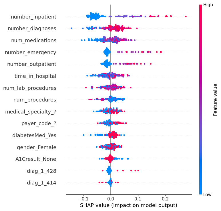
Question 1
问题 1
Which of the following features has a bigger range of effects on predictions (i.e. larger difference between most positive and most negative effect)
以下哪个特征对预测的影响范围更大(即最积极和最消极影响之间的差异更大)
diag_1_428orpayer_code_?
# set following variable to 'diag_1_428' or 'payer_code_?'
# feature_with_bigger_range_of_effects = ____
feature_with_bigger_range_of_effects = 'diag_1_428'
# Check your answer
q_1.check()
Correct
Uncomment the line below to see the solution and explanation.
取消注释下面这一行来查看解决方案和解释。
q_1.solution()Solution:
# the range of diag_1_428 is wider, largely due to the few points on the far right.
feature_with_bigger_range_of_effects = 'diag_1_428'
diag_1_428 的分布范围更广,主要是因为他在右边的一些点更远。
Question 2
问题 2
Do you believe the range of effects sizes (distance between smallest effect and largest effect) is a good indication of which feature will have a higher permutation importance? Why or why not?
您认为效应大小的范围(最小效应与最大效应之间的距离)是否能很好地说明哪个特征具有更高的排列重要性?为什么?
If the range of effect sizes measures something different from permutation importance: which is a better answer for the question "Which of these two features does the model say is more important for us to understand when discussing readmission risks in the population?"
如果 效应大小范围 与 变异重要性 所衡量的是不同的东西:那么对于 “在讨论人群中的再入院风险时,模型认为这两个特征中哪一个对我们来说更重要?”
Run the following line after you've decided your answer.
确定答案后,运行下面一行。
# Check your answer (Run this code cell to receive credit!)
q_2.solution()
Solution:
No. The width of the effects range is not a reasonable approximation to permutation importance. For that matter, the width of the range doesn't map well to any intuitive sense of "importance" because it can be determined by just a few outliers.
However if all dots on the graph are widely spread from each other, that is a reasonable indication that permutation importance is high.
Because the range of effects is so sensitive to outliers, permutation importance is a better measure of what's generally important to the model.
不。效应范围的宽度不是对排序重要性的合理近似。就此而言,范围的宽度不能很好地映射到任何直观的“重要性”感,因为它可以通过几个异常值来确定。但是,如果图上的所有点都彼此分散,则合理地表明排列重要性很高。由于效应范围对异常值非常敏感,因此排序重要性是衡量模型通常重要性的更好指标。
Question 3
问题 3
Both diag_1_428 and payer_code_? are binary variables, taking values of 0 or 1.
diag_1_428 和 payer_code_? 都是二进制变量,取值为 0 或 1。
From the graph, which do you think would typically have a bigger impact on predicted readmission risk:
从图表中,您认为哪个通常会对预测再入院风险产生更大的影响:
- Changing
diag_1_428from 0 to 1 - 将
diag_1_428从 0 更改为 1 - Changing
payer_code_?from 0 to 1 - 将
payer_code_?从 0 更改为 1
To save you scrolling, we have included a cell below to plot the graph again (this one runs quickly).
为了节省您的滚动时间,我们在下面添加了一个单元格来再次绘制图表(这个运行速度很快)。
shap.summary_plot(shap_values[1], small_val_X)
# Set following var to "diag_1_428" if changing it to 1 has bigger effect.  Else set it to 'payer_code_?'
# bigger_effect_when_changed = ____
bigger_effect_when_changed = "diag_1_428"
# Check your answer
q_3.check()
Correct:
While most SHAP values of diag_1_428 are small, the few pink dots (high values of the variable, corresponding to people with that diagnosis) have large SHAP values. In other words, the pink dots for this variable are far from 0, and making someone have the higher (pink) value would increase their readmission risk significantly.
In real-world terms, this diagnosis is rare, but poses a larger risk for people who have it.
In contrast, payer_code_? has many values of both blue and pink, and both have SHAP values that differ meaningfully from 0.
But changing payer_code_? from 0 (blue) to 1 (pink) is likely to have a smaller impact than changing diag_1_428.
虽然 diag_1_428 的大多数 SHAP 值都很小,但少数粉色点(变量的高值,对应于具有该诊断的人)具有较大的 SHAP 值。换句话说,这个变量的粉色点远离 0,让某人具有更高的(粉色)值会显著增加他们的再入院风险。在现实世界中,这种诊断很少见,但对患有这种疾病的人来说风险更大。相比之下,payer_code_? 有许多蓝色和粉色值,并且两者的 SHAP 值都与 0 有显著差异。但将 payer_code_? 从 0(蓝色)更改为 1(粉色)的影响可能小于更改 diag_1_428。
For a solution and explanation, uncomment the line below.
如需解决方案和解释,请取消注释下面的行。
# q_3.solution()Question 4
问题 4
Some features (like number_inpatient) have reasonably clear separation between the blue and pink dots. Other variables like num_lab_procedures have blue and pink dots jumbled together, even though the SHAP values (or impacts on prediction) aren't all 0.
某些特征(如 number_inpatient)的蓝点和粉点之间有相当明显的区分。其他变量(如 num_lab_procedures)的蓝点和粉点混杂在一起,即使 SHAP 值(或对预测的影响)并非全部为 0。
What do you think you learn from the fact that num_lab_procedures has blue and pink dots jumbled together? Once you have your answer, run the line below to verify your solution.
您认为从 num_lab_procedures 的蓝点和粉点混杂在一起这一事实中您学到了什么?得到答案后,运行下面的代码来验证您的解决方案。
# Check your answer (Run this code cell to receive credit!)
q_4.solution()
Solution:
The jumbling suggests that sometimes increasing that feature leads to higher predictions, and other times it leads to a lower prediction. Said another way, both high and low values of the feature can have both positive and negative effects on the prediction.
The most likely explanation for this "jumbling" of effects is that the variable (in this case num_lab_procedures) has an interaction effect with other variables. For example, there may be some diagnoses for which it is good to have many lab procedures, and other diagnoses where suggests increased risk. We don't yet know what other feature is interacting with num_lab_procedures though we could investigate that with SHAP contribution dependence plots.
解决方案:这种混乱表明,有时增加该特征会导致更高的预测,有时会导致更低的预测。换句话说,特征的高值和低值都会对预测产生积极和消极的影响。这种“混乱”影响的最可能解释是变量(在本例中为 num_lab_procedures)与其他变量有相互作用。例如,对于某些诊断,进行多次实验程序是有益的,而对于其他诊断,则表明风险增加。我们还不知道其他哪些特征与 num_lab_procedures 相互作用,但我们可以使用 SHAP 贡献依赖图来调查这一点。
Question 5
问题 5
Consider the following SHAP contribution dependence plot.
考虑以下 SHAP 贡献依赖图。
The x-axis shows feature_of_interest and the points are colored based on other_feature.
x 轴显示feature_of_interest,点根据other_feature着色。
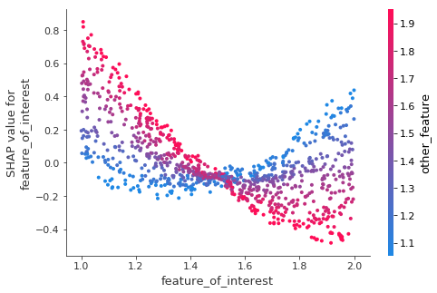
Is there an interaction between feature_of_interest and other_feature?
feature_of_interest 和 other_feature 之间是否存在相互作用?
If so, does feature_of_interest have a more positive impact on predictions when other_feature is high or when other_feature is low?
如果存在,那么 other_feature 较高时或 other_feature 较低时,feature_of_interest 对预测的影响是更积极吗?
Run the following code when you are ready for the answer.
当您准备好回答时,请运行以下代码。
# Check your answer (Run this code cell to receive credit!)
q_5.solution()
Solution:
First, recall that the SHAP vaue is an estimate of the impact of a given feature on the prediction. So, if the dots trend from upper left to lower right, that means low values of feature_of_interest cause higher predictions.
Returning to this graph:
feature_of_interest slopes downward for high values of other_feature. To see this, focus your eye on the pink dots (where other_feature is high) and imagine a best-fit line through those pink dots. It slopes down, suggesting that the prediction goes down as feature_of_interest increases.
Now focus your eye on the blue dots, and imagine a best fit line through those dots. It is generally pretty flat, possibly even curving up on the right side of the graph. So increasing feature_of_interest has a more positive impact on predictions when other_feature is high.
答案:首先,回想一下 SHAP 值是给定特征对预测影响的估计。因此,如果点从左上角趋向右下角,则意味着 feature_of_interest 的低值会导致更高的预测。
回到此图:
对于 other_feature 的高值,feature_of_interest 向下倾斜。要看到这一点,请将目光集中在粉红色点上(其中 other_feature 较高),并想象一条穿过这些粉红色点的最佳拟合线。它向下倾斜,表明随着 feature_of_interest 的增加,预测会下降。
现在将目光集中在蓝点上,并想象一条穿过这些点的最佳拟合线。它通常相当平坦,甚至可能在图表的右侧弯曲。因此,当 other_feature 较高时,增加 feature_of_interest 对预测有更积极的影响。
Question 6
问题 6
Review the summary plot for the readmission data by running the following cell:
通过运行以下单元格查看再入院数据的摘要图:
shap.summary_plot(shap_values[1], small_val_X)
Both num_medications and num_lab_procedures share that jumbling of pink and blue dots.
num_medications 和 num_lab_procedures 都具有粉色和蓝色点的混杂。
Aside from num_medications having effects of greater magnitude (both more positive and more negative), it's hard to see a meaningful difference between how these two features affect readmission risk. Create the SHAP dependence contribution plots for each variable, and describe what you think is different between how these two variables affect predictions.
除了 num_medications 具有更大的影响(既有更积极的影响也有更消极的影响)之外,很难看出这两个特征对再入院风险的影响之间存在有意义的差异。为每个变量创建 SHAP 依赖性贡献图,并描述您认为这两个变量对预测的影响之间的区别。
As a reminder, here is the code you previously saw to create this type of plot.
提醒一下,这是您之前看到的用于创建此类图的代码。
shap.dependence_plot(feature_of_interest, shap_values[1], val_X)And recall that your validation data is called small_val_X.
请记住,您的验证数据称为 small_val_X。
# Your code here
# ____
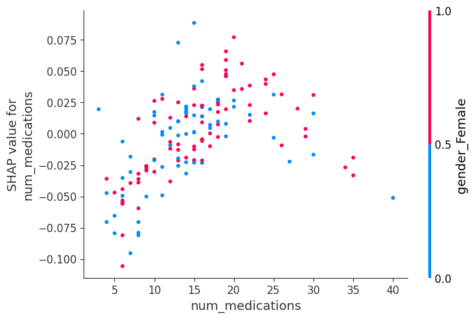
shap.dependence_plot('num_lab_procedures', shap_values[1], small_val_X)
shap.dependence_plot('num_medications', shap_values[1], small_val_X)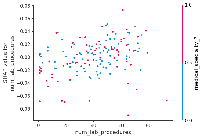
Then run the following line to compare your observations from this graph to the solution.
然后运行以下行,将该图的观察结果与解决方案进行比较。
# Check your answer (Run this code cell to receive credit!)
q_6.solution()
Solution:
Here is the code:
shap.dependence_plot('num_lab_procedures', shap_values[1], small_val_X)
shap.dependence_plot('num_medications', shap_values[1], small_val_X)
.
Loosely speaking, num_lab_procedures looks like a cloud with little disernible pattern. It does not slope steeply up nor down at any point. It's hard to say we've learned much from that plot. At the same time, the values are not all very close to 0. So the model seems to think this is a relevant feature. One potential next step would be to explore more by coloring it with different other features to search for an interaction.
On the other hand, num_medications clearly slopes up until a value of about 20, and then it turns back down. Without more medical background, this seems a surprising phenomenon... You could do some exploration to see whether these patients have unusual values for other features too. But a good next step would be to discuss this phenomenon with domain experts (in this case, the doctors).
解决方案:代码如下:
shap.dependence_plot('num_lab_procedures', shap_values[1], small_val_X)
shap.dependence_plot('num_medications', shap_values[1], small_val_X)
粗略地说,num_lab_procedures 看起来像一朵云,几乎没有可辨别的图案。它在任何一点都不会急剧上升或下降。很难说我们从该图中学到了很多东西。同时,这些值并不都非常接近 0。因此,模型似乎认为这是一个相关的特征。下一步可能通过用不同的其他特征着色来探索更多,以寻找相互作用。
另一方面,num_medications 明显上升到大约 20 的值,然后又回落。如果没有更多的医学背景,这似乎是一个令人惊讶的现象……您可以进行一些探索,看看这些患者是否也有其他特征的异常值。但下一步最好是与领域专家(在本例中是医生)讨论这种现象。
Congratulations
恭喜
That's it! Machine learning models should not feel like black boxes any more, because you have the tools to inspect them and understand what they learn about the world.
就是这样!机器学习模型不再像黑匣子,因为你有工具来检查它们并了解它们对世界的了解。
This is an excellent skill for debugging models, building trust, and learning insights to make better decisions. These techniques have revolutionized how I do data science, and I hope they do the same for you.
这是调试模型、建立信任和学习洞察力以做出更好决策的绝佳技能。这些技术彻底改变了我进行数据科学的方式,我希望它们也能为你带来同样的改变。
Real data science involves an element of exploration. I hope you find an interesting dataset to try these techniques on (Kaggle has a lot of free datasets to try out). If you learn something interesting about the world, share your work in this forum. I'm excited to see what you do with your new skills.
真正的数据科学涉及探索元素。我希望你能找到一个有趣的数据集来尝试这些技术(Kaggle 有很多 免费数据集 可供尝试)。如果你学到了一些关于世界的有趣知识,请 在此论坛 分享你的工作。我很高兴看到你用你的新技能做了什么。