Now that you are familiar with the coding environment, it's time to learn how to make your own charts!
现在您已经熟悉了编码环境,是时候学习如何制作自己的图表了!
In this tutorial, you'll learn just enough Python to create professional looking line charts. Then, in the following exercise, you'll put your new skills to work with a real-world dataset.
在本教程中,您将学习足够的 Python 来创建具有专业外观的折线图。 然后,在下面的练习中,您将运用新技能处理现实世界的数据集。
Set up the notebook
设置笔记本
We begin by setting up the coding environment. (This code is hidden, but you can un-hide it by clicking on the "Code" button immediately below this text, on the right.)
我们首先设置编码环境。 (此代码是隐藏的,但您可以通过单击右侧紧邻此文本下方的“代码”按钮来取消隐藏它。)
import pandas as pd
pd.plotting.register_matplotlib_converters()
import matplotlib.pyplot as plt
%matplotlib inline
import seaborn as sns
print("Setup Complete")
Setup CompleteSelect a dataset
选择一个数据集
The dataset for this tutorial tracks global daily streams on the music streaming service Spotify. We focus on five popular songs from 2017 and 2018:
本教程的数据集跟踪音乐流媒体服务 Spotify 上的全球每日流媒体。 我们重点关注 2017 年和 2018 年的五首流行歌曲:
-
"Shape of You", by Ed Sheeran (link)
-
"Despacito", by Luis Fonzi (link)
-
"Something Just Like This", by The Chainsmokers and Coldplay (link)
-
"HUMBLE.", by Kendrick Lamar (link)
-
"Unforgettable", by French Montana (link)
-
《Shape of You》,作者:Ed Sheeran (link)
-
《Despacito》,作者 Luis Fonzi (link)
-
《Something Just Like This》, 作者:The Chainsmokers 和 Coldplay (link)
-
《谦虚》,作者:Kendrick Lamar (link)
-
《难忘》,作者:French Montana (link)
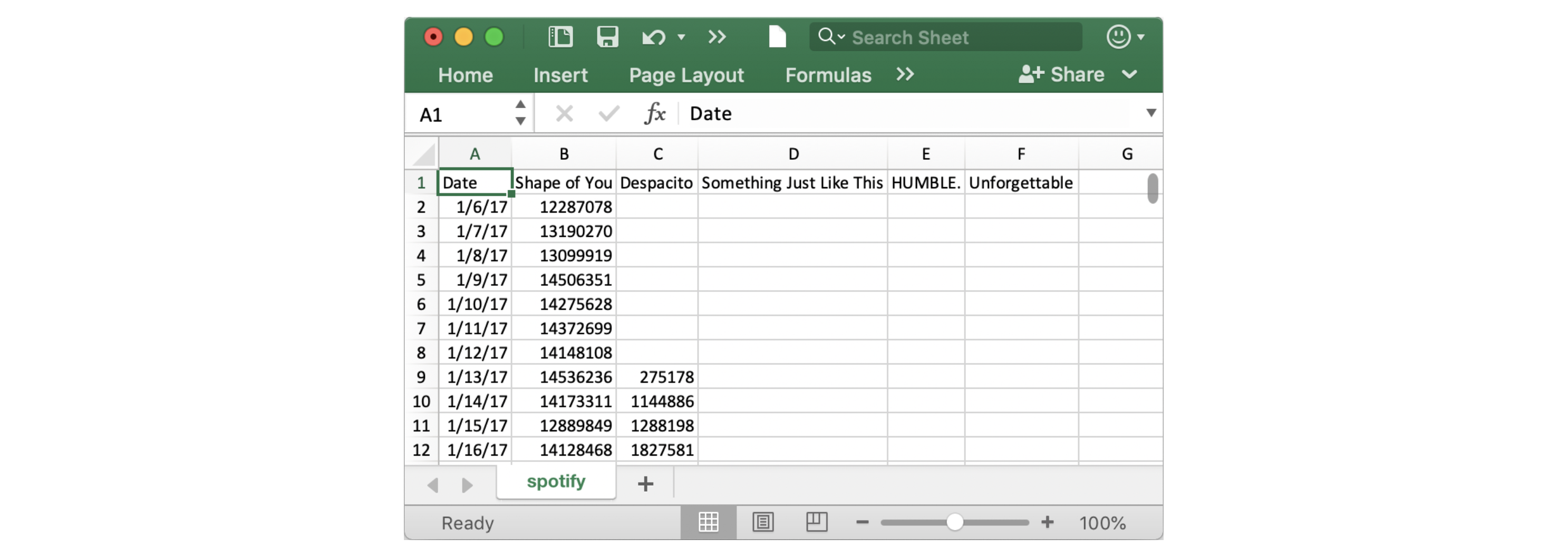
Notice that the first date that appears is January 6, 2017, corresponding to the release date of "The Shape of You", by Ed Sheeran. And, using the table, you can see that "The Shape of You" was streamed 12,287,078 times globally on the day of its release. Notice that the other songs have missing values in the first row, because they weren't released until later!
请注意,出现的第一个日期是 2017 年 1 月 6 日,对应于 Ed Sheeran 的《The Shape of You》的发行日期。 而且,通过该表格,您可以看到《The Shape of You》在发行当天的全球播放量为 12,287,078 次。 请注意,其他歌曲在第一行中缺少值,因为它们直到后来才发布!
Load the data
加载数据
As you learned in the previous tutorial, we load the dataset using the pd.read_csv command.
正如您在上一教程中了解到的,我们使用pd.read_csv命令加载数据集。
# Path of the file to read
spotify_filepath = "../00 datasets/alexisbcook/data-for-datavis/spotify.csv"

# Read the file into a variable spotify_data
spotify_data = pd.read_csv(spotify_filepath, index_col="Date", parse_dates=True)
The end result of running both lines of code above is that we can now access the dataset by using spotify_data.
运行上面两行代码的最终结果是我们现在可以使用spotify_data访问数据集。
Examine the data
检查数据
We can print the first five rows of the dataset by using the head command that you learned about in the previous tutorial.
我们可以使用您在上一教程中了解的head命令打印数据集的 最开始 五行。
# Print the first 5 rows of the data
spotify_data.head()| Shape of You | Despacito | Something Just Like This | HUMBLE. | Unforgettable | |
|---|---|---|---|---|---|
| Date | |||||
| 2017-01-06 | 12287078 | NaN | NaN | NaN | NaN |
| 2017-01-07 | 13190270 | NaN | NaN | NaN | NaN |
| 2017-01-08 | 13099919 | NaN | NaN | NaN | NaN |
| 2017-01-09 | 14506351 | NaN | NaN | NaN | NaN |
| 2017-01-10 | 14275628 | NaN | NaN | NaN | NaN |
Check now that the first five rows agree with the image of the dataset (from when we saw what it would look like in Excel) above.
现在检查前五行是否与上面的数据集图像一致( 来自我们在 Excel 中看到的情况 )。
Empty entries will appear as
NaN, which is short for "Not a Number".空条目将显示为
NaN,它是Not a Number的缩写。
We can also take a look at the last five rows of the data by making only one small change (where .head() becomes .tail()):
我们还可以通过仅进行一个小更改来查看数据的最后五行(其中.head()变为.tail()):
# Print the last five rows of the data
spotify_data.tail()| Shape of You | Despacito | Something Just Like This | HUMBLE. | Unforgettable | |
|---|---|---|---|---|---|
| Date | |||||
| 2018-01-05 | 4492978 | 3450315.0 | 2408365.0 | 2685857.0 | 2869783.0 |
| 2018-01-06 | 4416476 | 3394284.0 | 2188035.0 | 2559044.0 | 2743748.0 |
| 2018-01-07 | 4009104 | 3020789.0 | 1908129.0 | 2350985.0 | 2441045.0 |
| 2018-01-08 | 4135505 | 2755266.0 | 2023251.0 | 2523265.0 | 2622693.0 |
| 2018-01-09 | 4168506 | 2791601.0 | 2058016.0 | 2727678.0 | 2627334.0 |
Thankfully, everything looks about right, with millions of daily global streams for each song, and we can proceed to plotting the data!
值得庆幸的是,一切看起来都很正常,每首歌每天都有数百万的全球流媒体,我们可以继续绘制数据!
Plot the data
绘制数据
Now that the dataset is loaded into the notebook, we need only one line of code to make a line chart!
现在数据集已加载到笔记本中,我们只需要一行代码即可制作折线图!
# Line chart showing daily global streams of each song
sns.lineplot(data=spotify_data)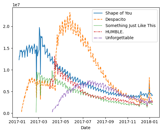
As you can see above, the line of code is relatively short and has two main components:
正如您在上面看到的,该代码行相对较短,并且有两个主要组成部分:
sns.lineplottells the notebook that we want to create a line chart.- _Every command that you learn about in this course will start with
sns, which indicates that the command comes from the seaborn package. For instance, we usesns.lineplotto make line charts. Soon, you'll learn that we usesns.barplotandMARKDOWN_HASHda143d52d28fae106418c11cbefa48d5MARKDOWNHASHto make bar charts and heatmaps, respectively.
- _Every command that you learn about in this course will start with
sns.lineplot告诉笔记本我们要创建折线图。- _您在本课程中学习的每个命令都将以
sns开头,这表明该命令来自 seaborn 包。 例如,我们使用sns.lineplot来制作折线图。 很快,您就会了解到我们分别使用sns.barplot和MARKDOWN_HASHda143d52d28fae106418c11cbefa48d5MARKDOWNHASH来制作条形图和热力图。
- _您在本课程中学习的每个命令都将以
data=spotify_dataselects the data that will be used to create the chart.data=spotify_data选择将用于创建图表的数据。
Note that you will always use this same format when you create a line chart, and the only thing that changes with a new dataset is the name of the dataset. So, if you were working with a different dataset named financial_data, for instance, the line of code would appear as follows:
请注意,创建折线图时将始终使用相同的格式,并且新数据集唯一改变的是数据集的名称。 因此,例如,如果您正在使用名为financial_data的不同数据集,则代码行将显示如下:
sns.lineplot(data=financial_data)Sometimes there are additional details we'd like to modify, like the size of the figure and the title of the chart. Each of these options can easily be set with a single line of code.
有时我们想要修改其他细节,例如图形的大小和图表的标题。 这些选项中的每一个都可以使用一行代码轻松设置。
# Set the width and height of the figure
# 设置图像的宽与高
plt.figure(figsize=(14,6))

# Add title
# 增加标题
plt.title("Daily Global Streams of Popular Songs in 2017-2018")

# Line chart showing daily global streams of each song
# 显示每首歌曲每日全球流量的折线图
sns.lineplot(data=spotify_data)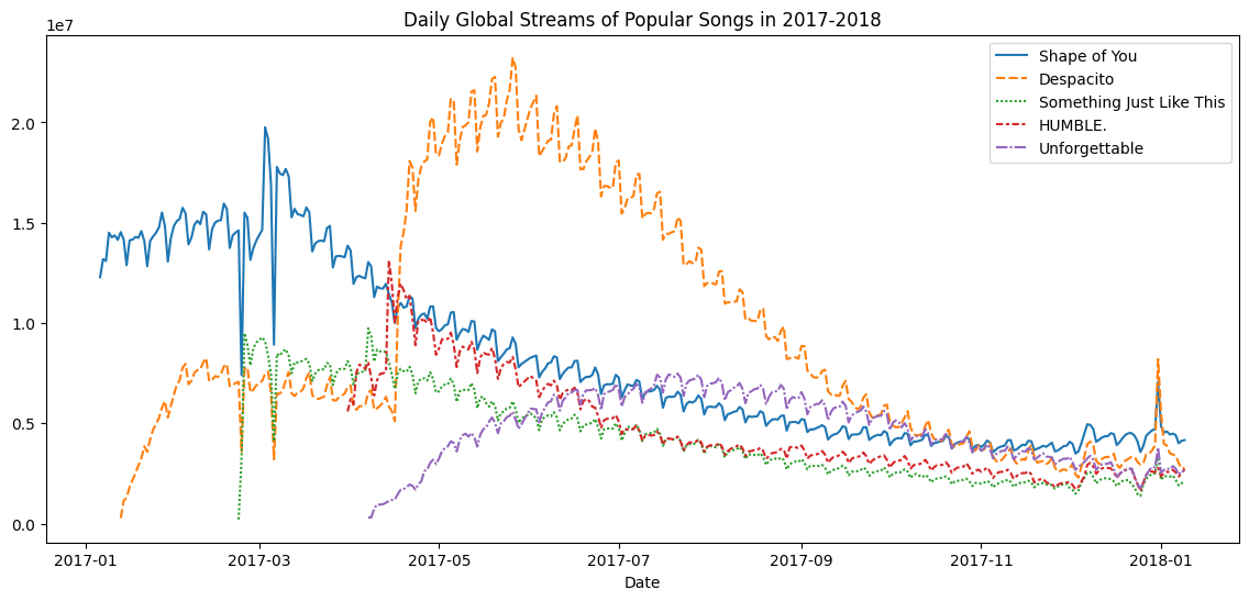
The first line of code sets the size of the figure to 14 inches (in width) by 6 inches (in height). To set the size of any figure, you need only copy the same line of code as it appears. Then, if you'd like to use a custom size, change the provided values of 14 and 6 to the desired width and height.
第一行代码将图形的大小设置为14英寸(宽)x6英寸(高)。 要设置 任何图形 的大小,您只需复制显示的同一行代码即可。 然后,如果您想使用自定义尺寸,请将提供的14和6值更改为所需的宽度和高度。
The second line of code sets the title of the figure. Note that the title must always be enclosed in quotation marks ("...")!
第二行代码设置图形的标题。 请注意,标题必须始终用引号引起来("...")!
Plot a subset of the data
绘制数据的子集
So far, you've learned how to plot a line for every column in the dataset. In this section, you'll learn how to plot a subset of the columns.
到目前为止,您已经学习了如何为数据集中的 每 列绘制一条线。 在本节中,您将学习如何绘制列的 子集 。
We'll begin by printing the names of all columns. This is done with one line of code and can be adapted for any dataset by just swapping out the name of the dataset (in this case, spotify_data).
我们首先打印所有列的名称。 这是通过一行代码完成的,并且只需交换数据集的名称(在本例中为spotify_data)即可适用于任何数据集。
list(spotify_data.columns)['Shape of You',
'Despacito',
'Something Just Like This',
'HUMBLE.',
'Unforgettable']In the next code cell, we plot the lines corresponding to the first two columns in the dataset.
在下一个代码单元中,我们绘制与数据集中前两列相对应的折线。
# Set the width and height of the figure
plt.figure(figsize=(14,6))

# Add title
plt.title("Daily Global Streams of Popular Songs in 2017-2018")

# Line chart showing daily global streams of 'Shape of You'
sns.lineplot(data=spotify_data['Shape of You'], label="Shape of You")

# Line chart showing daily global streams of 'Despacito'
sns.lineplot(data=spotify_data['Despacito'], label="Despacito")

# Add label for horizontal axis
# 增加横坐标标签
plt.xlabel("Date")
Text(0.5, 0, 'Date')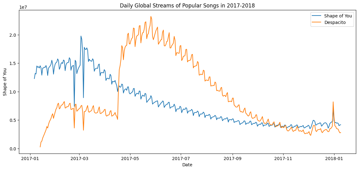
The first two lines of code set the title and size of the figure (and should look very familiar!).
前两行代码设置了图形的标题和大小(并且应该看起来非常熟悉!)。
The next two lines each add a line to the line chart. For instance, consider the first one, which adds the line for "Shape of You":
接下来的两行各向折线图添加一条线。 例如,考虑第一个,它添加了Shape of You行:
# Line chart showing daily global streams of 'Shape of You'
sns.lineplot(data=spotify_data['Shape of You'], label="Shape of You")
This line looks really similar to the code we used when we plotted every line in the dataset, but it has a few key differences:
该行看起来与我们绘制数据集中的每一行时使用的代码非常相似,但它有一些关键区别:
- Instead of setting
data=spotify_data, we setdata=spotify_data['Shape of You']. In general, to plot only a single column, we use this format with putting the name of the column in single quotes and enclosing it in square brackets. (To make sure that you correctly specify the name of the column, you can print the list of all column names using the command you learned above.) - 我们不设置
data=spotify_data,而是设置data=spotify_data['Shape of You']。 一般来说,为了仅绘制单个列,我们使用这种格式,将列的名称放在单引号中并将其括在方括号中。 (为了确保正确指定列的名称,您可以使用上面学到的命令打印所有列名称的列表。) - We also add
label="Shape of You"to make the line appear in the legend and set its corresponding label. - 我们还添加
label="Shape of You"以使线条出现在图例中并设置其相应的标签。
The final line of code modifies the label for the horizontal axis (or x-axis), where the desired label is placed in quotation marks ("...").
最后一行代码修改水平轴(或 x 轴)的标签,其中所需的标签放在引号中("...")。
What's next?
下一步是什么?
Put your new skills to work in a coding exercise!
将您的新技能运用到 编码练习!